↬ bordering a png

today we shall discuss about:
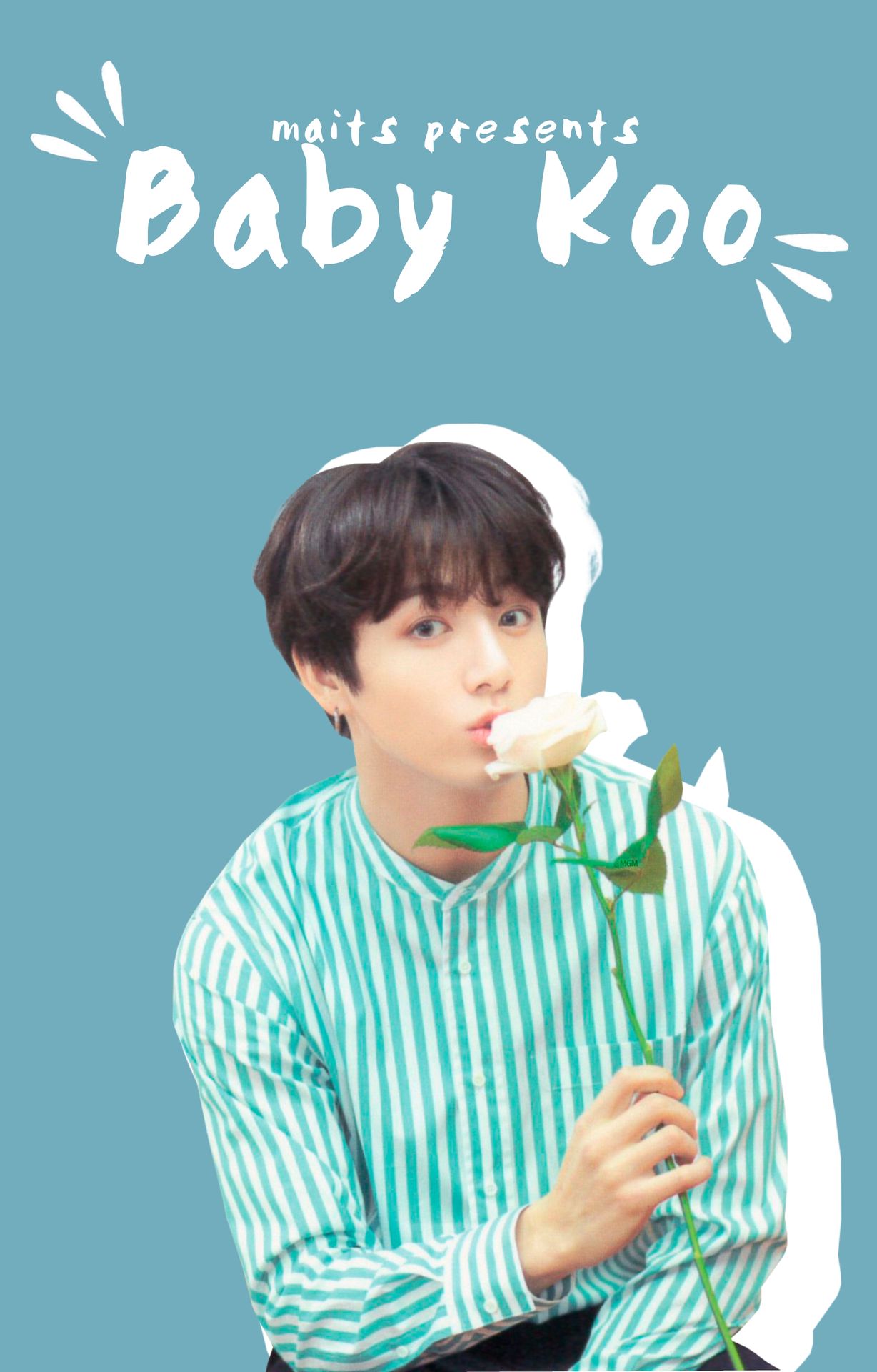
bordering a png
hello hello!
today i will be explaining how to make this edit and since it's a fun little one (it's super easy too) it shouldn't take too much time either! do credit me if it helped, specific instructions are given in terms & conditions.
there will be no resources for this chapter (you can get the paint blots in the transparent pngs resource chapter). special credits to beapanda on deviant art for the jungkook png!
you will require the app:
i. over
steps to make this dumbassery ::
¹; canvas
if you're going to make a wp book cover, the measurements are 2000x3127 px. when you open over, click on the plus sign at the bottom of the screen and enter the measurements (remember to switch off constrain proportions). or you can select any of the given measurements (they have lots of those: from insta stories to google boards so take your pick lmao).
²; background
open your faceclaim by clicking on image.
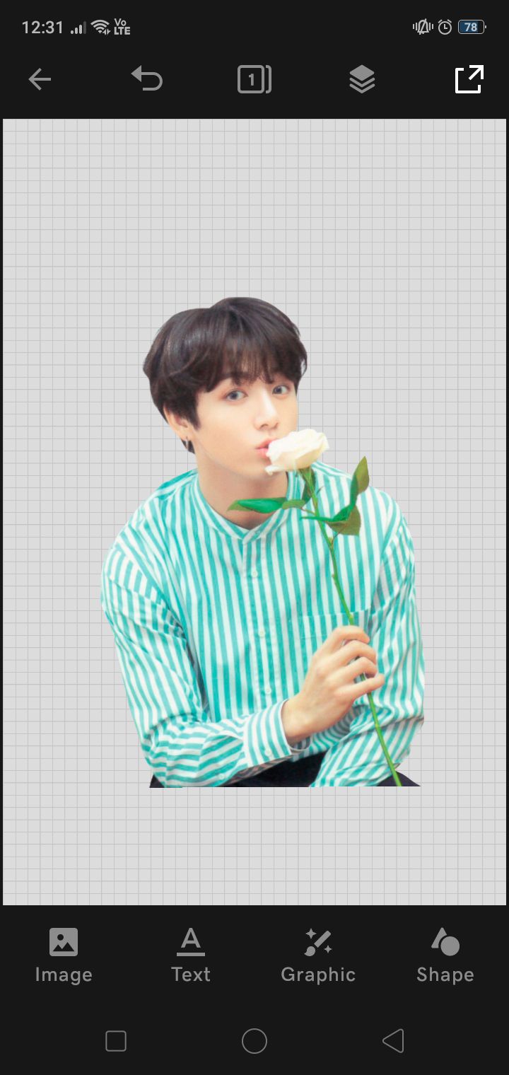
change the background color to whatever you like (but please make it go well with the faceclaim or i will throw a chair on you- jkjkjk i won't) by tapping on the background and selecting the edit option. (don't select the faceclaim!)
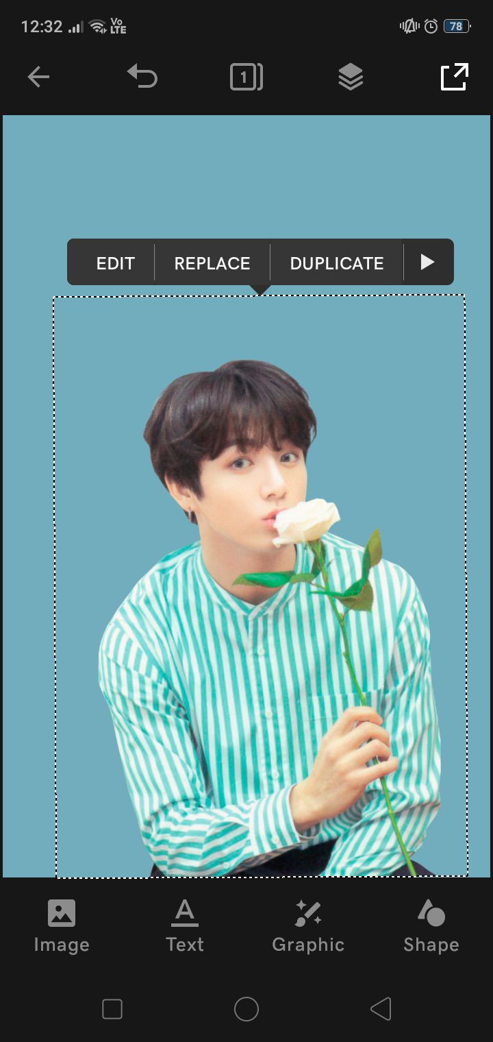
then tap on the faceclaim and you'll see those options in that black tag above.
³; duplication and tint
select the option duplicate. your image will be duplicated to the exact size and shape. go to layers (that icon between the 1 icon and the save button) and you will see this:
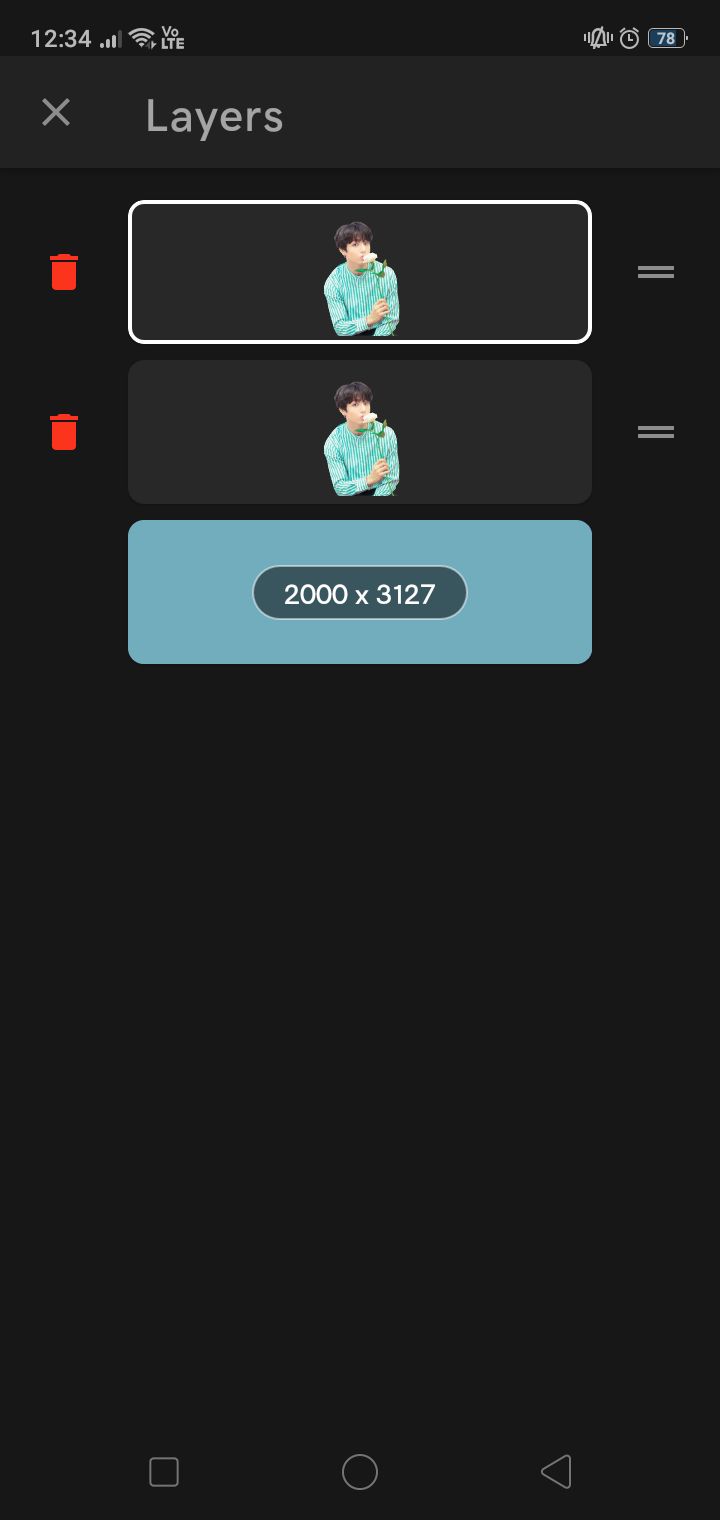
select the one below the white outlined layer and you will see a bunch of options to edit it. scroll right and you will reach an option called tint.
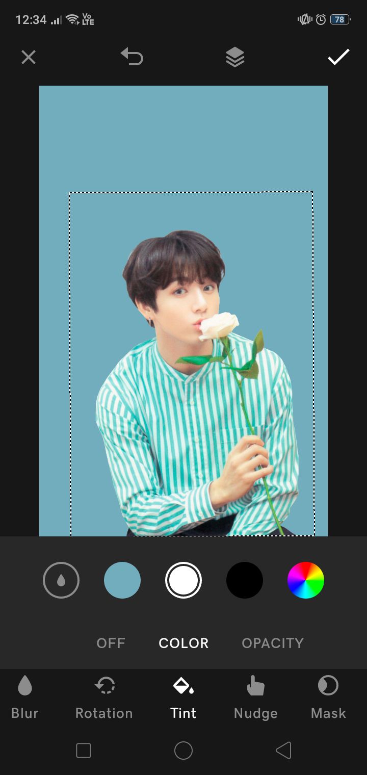
select the color white and change the opacity to 100.
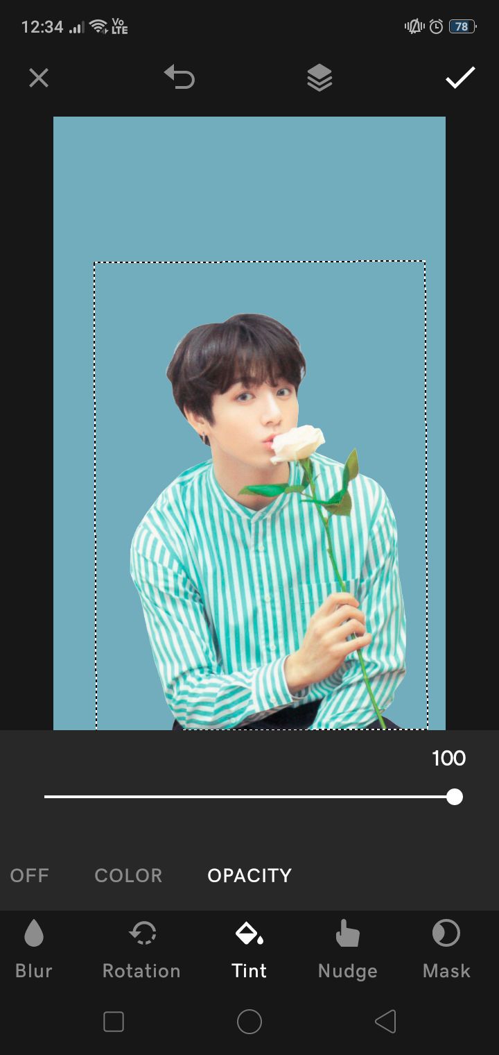
ik you can see nth but wait and watch.
⁴; size and adjustments
scroll left and select the size option. increase the size to your fancy (but don't make it too big):
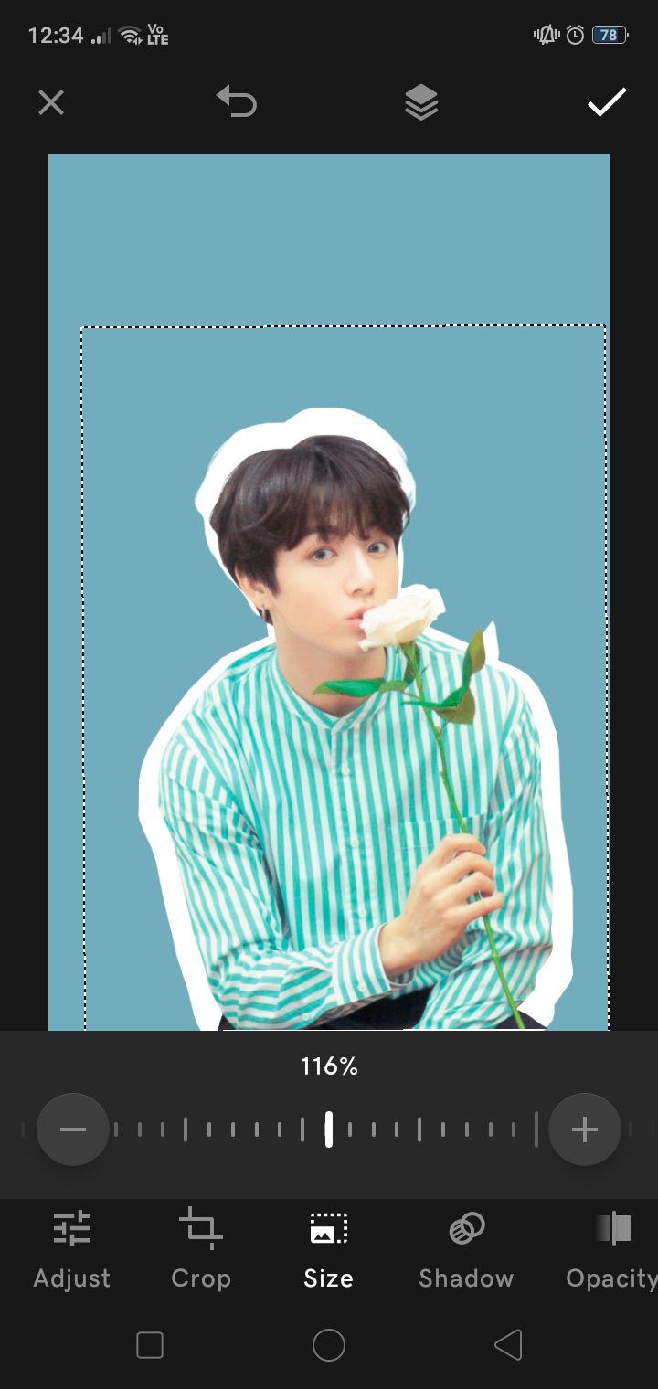
it should be big enough to sort of outline the faceclaim. ik it doesn't look very nice, so let's shift its position. you can manually do it using your fingers but if you have ocd like me and want a refined touch, use nudge (scroll extreme right, it's next to tint) and make adjustments using the arrows.
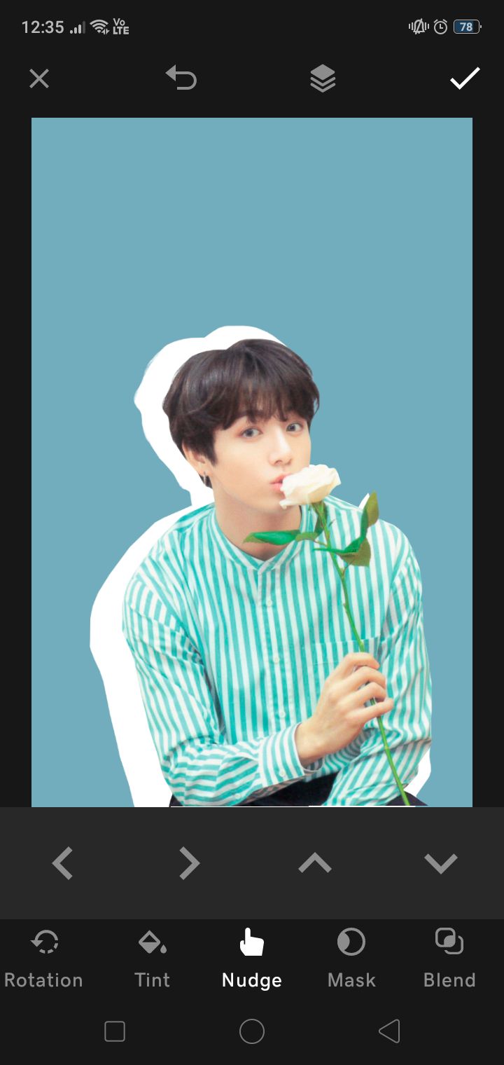
i personally think it looks best in extreme right or left (center it looks a bit awkward):

you can make adjustments in the size to see what suits your character the best. if need be, you can nudge the faceclaim (the top-most layer, remember?) and see what fits best.
⁵; finishing touches
add your text and other extra effects:

i went with extreme right bc it personally looked the best. you can use this for more complex edits too and i think it will look good. imo, don't go with any other color besides white for the border. it is a bit too risky and might end up looking tacky.
oh and the font used was the editor. like i said, the paint blots are not part of the font and are available in the resource pack transparent pngs.
i hope y'all have fun making this uwu

Bạn đang đọc truyện trên: AzTruyen.Top