Hair Coloring Tutorial
You see, I have many ways of coloring hair. Most of them I've only used a couple of times and have never even posted soooo yeah. Here's one of the ways I color, I guess .-.
I know certain person *cough cough* Larkin *cough* who said she needed this specific kind of tutorial so here you go!
Step 1
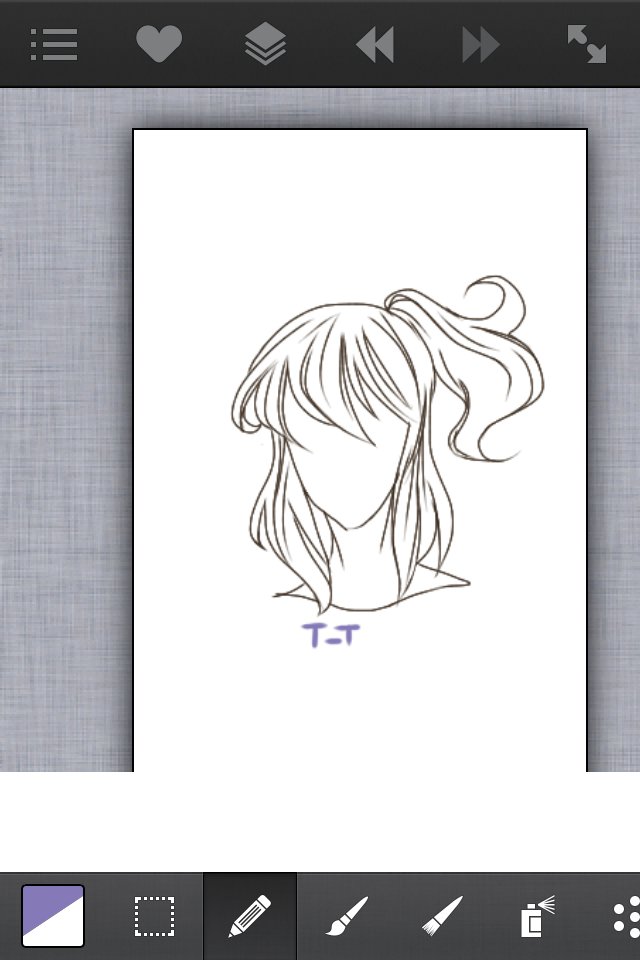
Have a lineart. If your problem is drawing the hair itself, please comment so I can see if I need to make one about drawing and not coloring. It's very important that you now how to draw hair before coloring.
Step 2
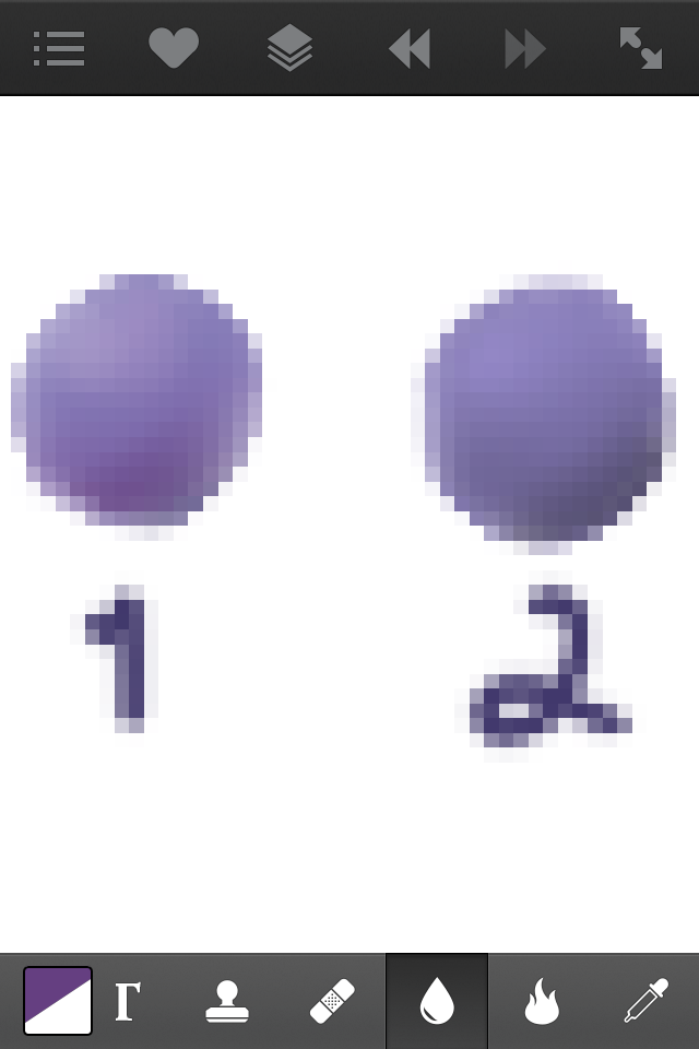
Pick your colors. I chose a lavender-ish violet. Now look at this, which one looks more intersting? Hint, it's probably no. 1. The reason no. 2 looks so muddy is because I never shifted the hue while making it darker. Remember to shift the hue to the warmer colors for shadows and cooler colors for highlights when your base color is a cool color and vice versa when it's warm colors. Making a sphere like this will help.
Step 3
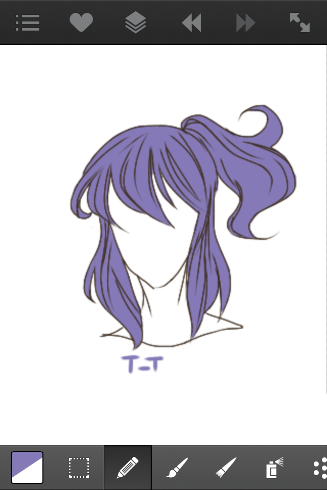
Tool: Default Brush
Fill in the line art with your base color. If you're color picking from the sphere you made like me, pick the middle most shade. Put it on a layer below the line art, this will be the only layer we'll be using for color and shading.
Step 4
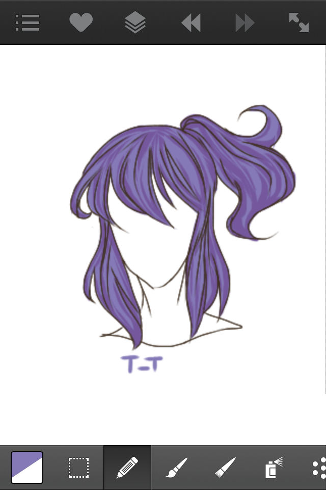
Tool: Default Brush
Take a color that's only slightly darker than the base color (remember to shift hues) and use it to divide the hair into clumps or bunches. Remember when I mentioned how drawing is needed for coloring? Well that's cause if you can draw the hair and you still have space in between to fill with colors, you've probably already divided them into bunches. Follow where your line art has bunches and connect them from top to bottom and them add some not connected divisions of smaller bunches in the middle of them. Always follow the flow of the hair, curly, straight etc. Then go over with your base color and a thinner brush size just add random hair strand here and there.
Step 5
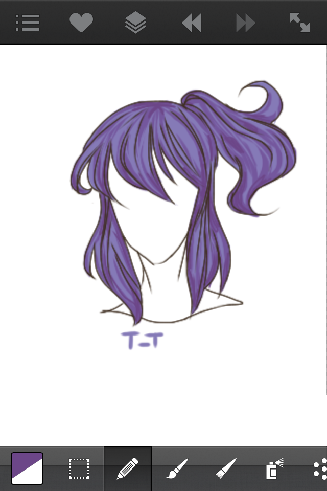
Tool: Default Brush
Use an even darker shade (you should now be halfway between the base and the darkest shade) and add the strokes of color where the most shadows are and where shadows from the face or distance form. Be sparse in doing so, these are meant to be few and far apart.
Step 6
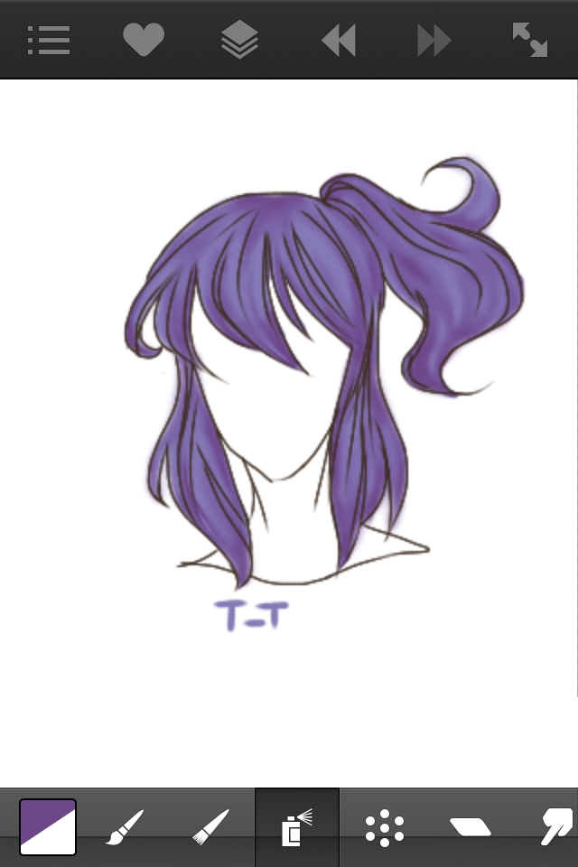
Tool: Blur Tool
Blur the bloody hell out of it. It should look like a blob of still recognizable shadows.
Step 7

Tool: Airbrush Tool
Take the color you just used and use a thin but high opacity airbrush to define the divisions even more.
Step 8
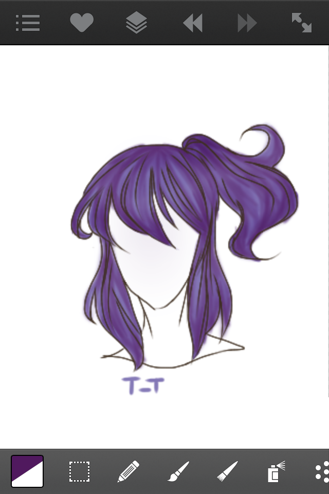
Tool: Burn Tool/Airbrush Tool
Depending on the app, you might have to use different things. In ASL (ArtStudio Lite), there's something called the burn tool which will only affect the part of the layer with color it 'burns' the colors making them darker but not one-toned. This is how I used to shade but but it layers WAY too dark so only do it in one stroke. If you have a burn tool, use a big, low opacity one and go over the the parts with more shadows. If you don't have it, just use the airbrush and just make it low opacity. You'll have to erase the parts that overlap the lines though. Use the darkest color you have because this is the final step for shadows!
Step 9
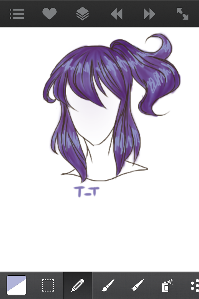
Tool: Default Brush
Now we do the highlights. Depending on how bright you want them to be, pick a lighter color than the base. I chose a quite bright color and I usually do something a little less bright. Remember that this time since the base is cool, make the highlight cool too. Now picture those things they in the hospital that measure heartbeats, then imagine someone who's seeing her senpai shirtless and they have one of those things attached to them. Use those kind of lines in between the shadows.
Step 10

Tool: Blur Tool
If it wasn't obvious. Just blur, blur, blur the highlights out.
Step 11
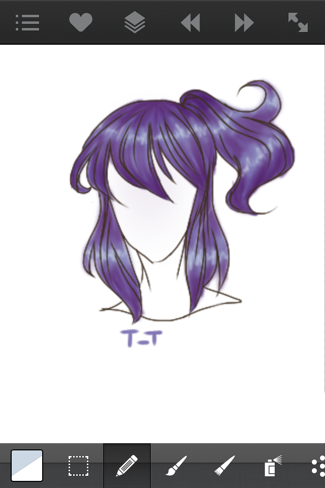
Tool: Default Brush
Now take your brightest color and do the same kind of lines but thinner and smaller in between the highlight you just made then blur it out again.
Step 12
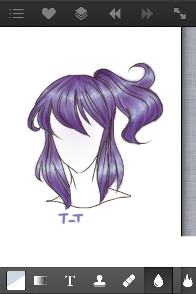
Tool: Airbrush Tool
This is the final stretch, guys! To make it lighter and more like the base color, take the color you just used, the lightest, and use a super thin, low opacity. Now go over the divisions again except this time with highlights. Do this sparsely, you don't want to lose the shadows.
Note: You can and probably should add or subtract highlights and shadows to your liking. Just skip the step if you think it's too dark/light and just repeat the same process of shading I did and just add more colors if you want it darker/lighter.
DONE!
Hope this helped. How did I do? What should I do next? If anything confused you, comment so I can help explain ;3
Penn Out ☆彡
Bạn đang đọc truyện trên: AzTruyen.Top