@Starwishi
x_spacebars_x
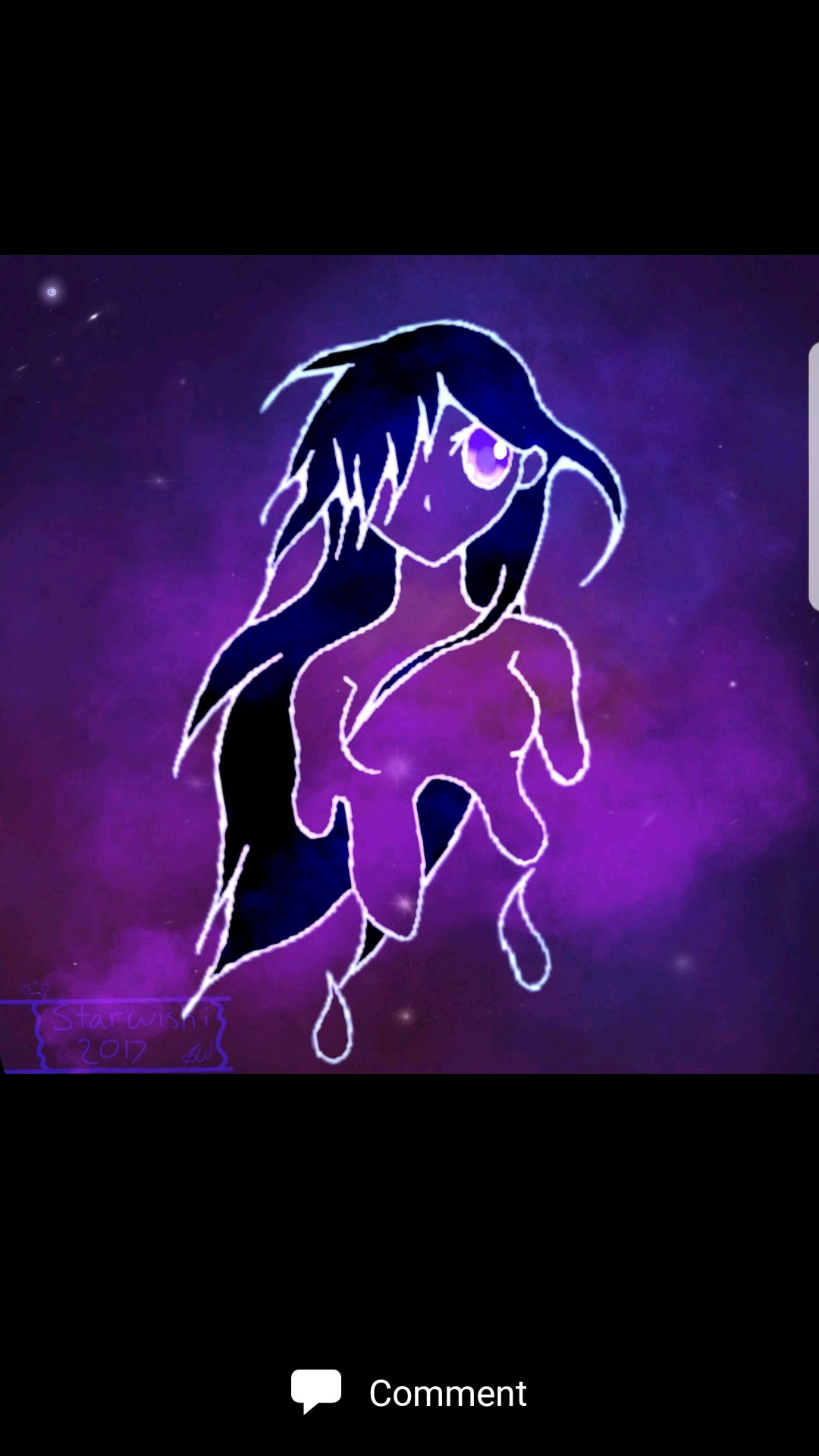
Okay the first thing I see is, as you said in your book, the lines are thick, which doesn't give it a nice look. As I said in the picture you should try to use more smoother lines.
And another thing, you need to leave a space in between the eyes and the face. Don't put a big gap, just a small gap will do well. Another thing you should look out for when you use this little tip is try not to squish everything together. Just remember a small gap is needed.
Another thing is about the girl's body. Her breast pushed up way to high. They should be lower. If you look at the picture it'll explain better than me writing it.
Despite these little mistakes, the art work is pretty decent. You should put a little emotion into the eyes, so the viewer can feel something that the character is feeling. Art is all based on feelings. Unless, you don't want any feeling in the artwork and you drew it for fun. Which is okay!
I hope this helped you out :)
Porshswing
Aaaaa so
1 good job on the galaxy. I can't draw galaxies if my life depended on it xD so yours is amazing. Just try adding more stars next time?
2
the eyes are very nicely colored! My only recommendation is that you shrink them a little bit? They're large on the head.
3 too many strands of hair In some places and not enough in others. This is minor, but you need less hair for the bangs and not hair at the tip. It just looks better to me
That's really it. Space covered everything else. I just recommend trying new things and seeing what works for you I'm assuming you're going for an anime style, but that may not even be the best choice for you. Try to branch out :)
Happy doodlin'!
Bạn đang đọc truyện trên: AzTruyen.Top