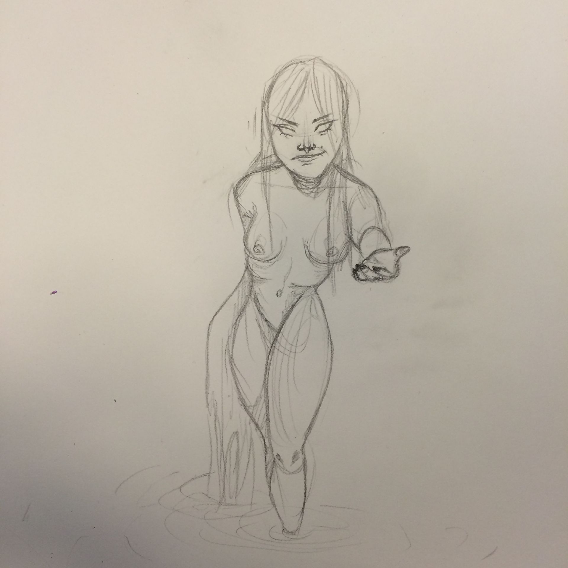
"Nøkken" in Purple/Violet quality contrast
(finished piece above, progress pictures at the very end)
So, first i'd like to talk about the picture, then the origin. if you follow my art account on instagram (*cough* go.home.you.punk *cough*) youve probably already seen this but shhhh let me live kk
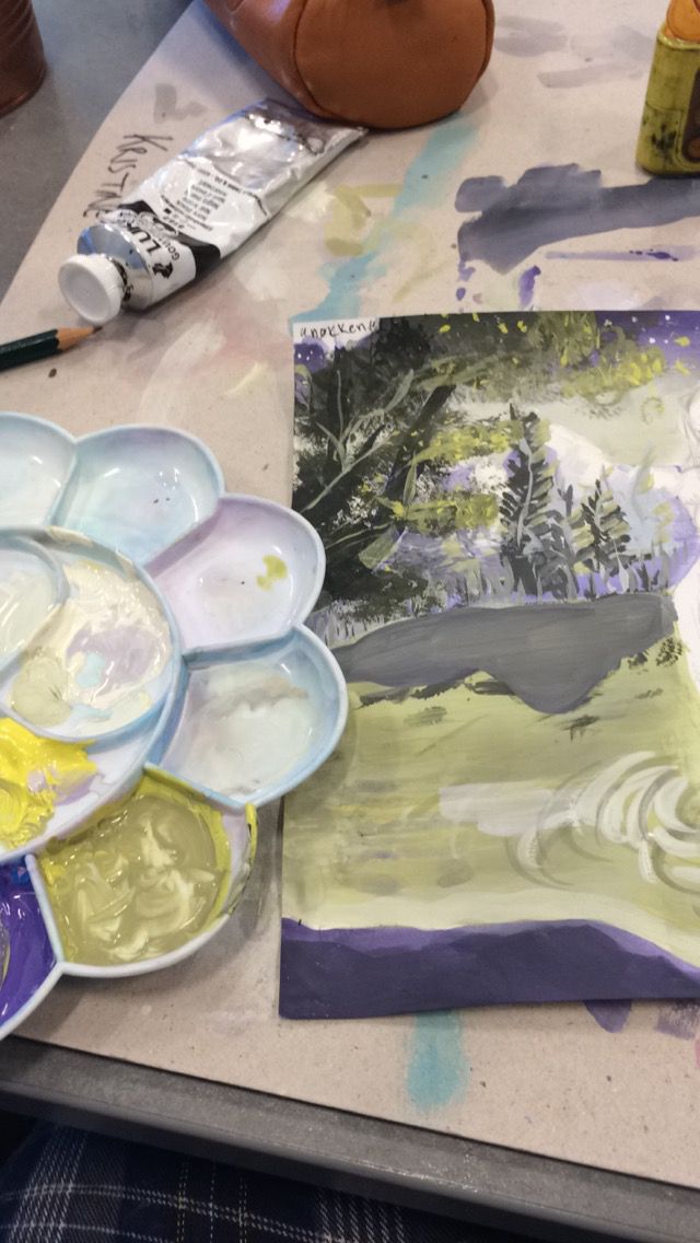
so, this is (obviously) for art class lol. we've been doing some colour studies, and this is the "quality contrast":
"Quality Contrast (or Intensity Contrast): The quality contrast describes the distinction between pure colours and murky colours. Mixing pure colours with grey shades makes the former murky and dull, and the quality of colour purity is lost. Pure colours have a dominating effect over murky colours.", just that instead of for example yellow and grey, we use yellow and purple.
So yes, the only colours ive used it purple, yellow, black and white. no green aha.
Now, for me, when you first look at the painting its kinda look "oh damn", but then when you study it you see how crap it really is and how dumb some stuff looks but sighs whatever. everybody in my class hates painting but i love it?? but i cant paint scenery and landscapes ahahhahah. i was trying to channel my inner bob ross, but man, its impossible. that guy's a superhero ngl he makes it look s o easy i cant.
so about the origin, Nøkken is a creature from Germanic and Scandinavian folklore. They were male water spirits who played enchanted songs on the violin, luring women and children to drown in lakes or streams.
If you're interested in knowing more, just google nøkken lmao.
tfw u like the sketch better than the actual painting:-)
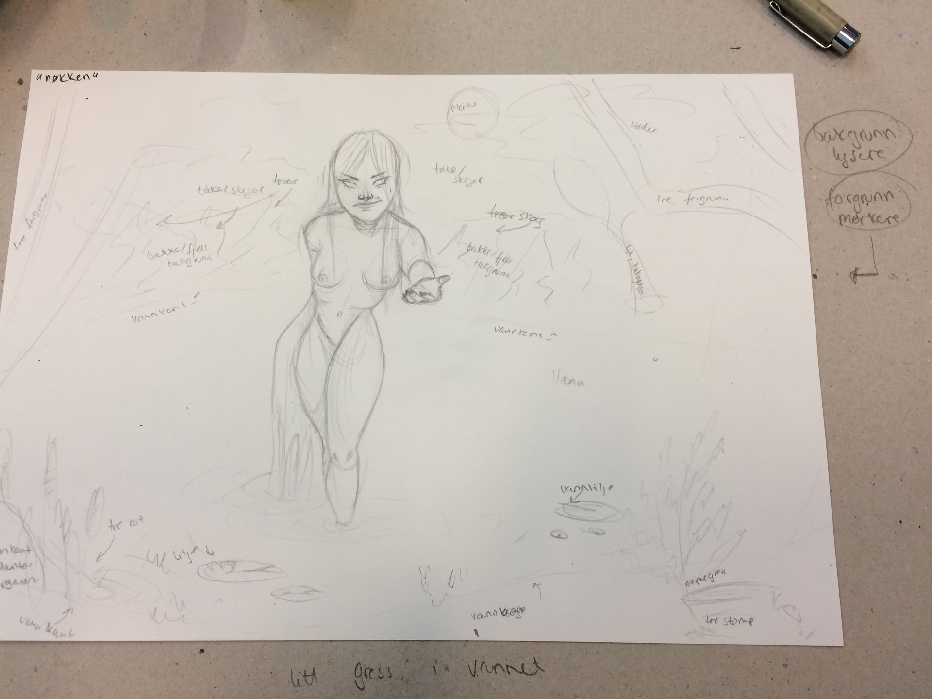
plan sketches. much norwegian very organized.

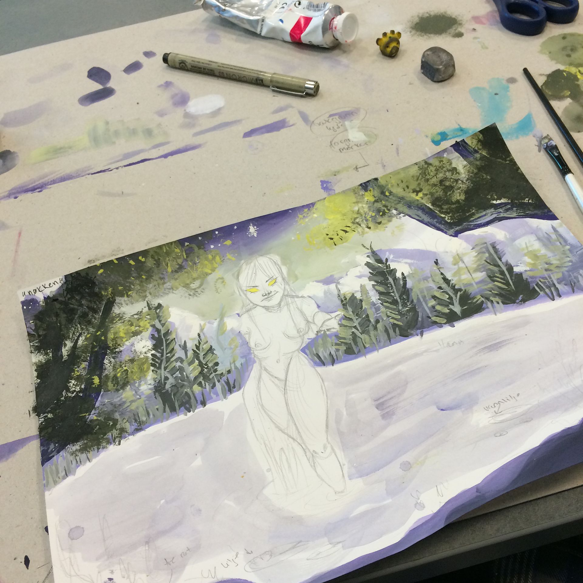
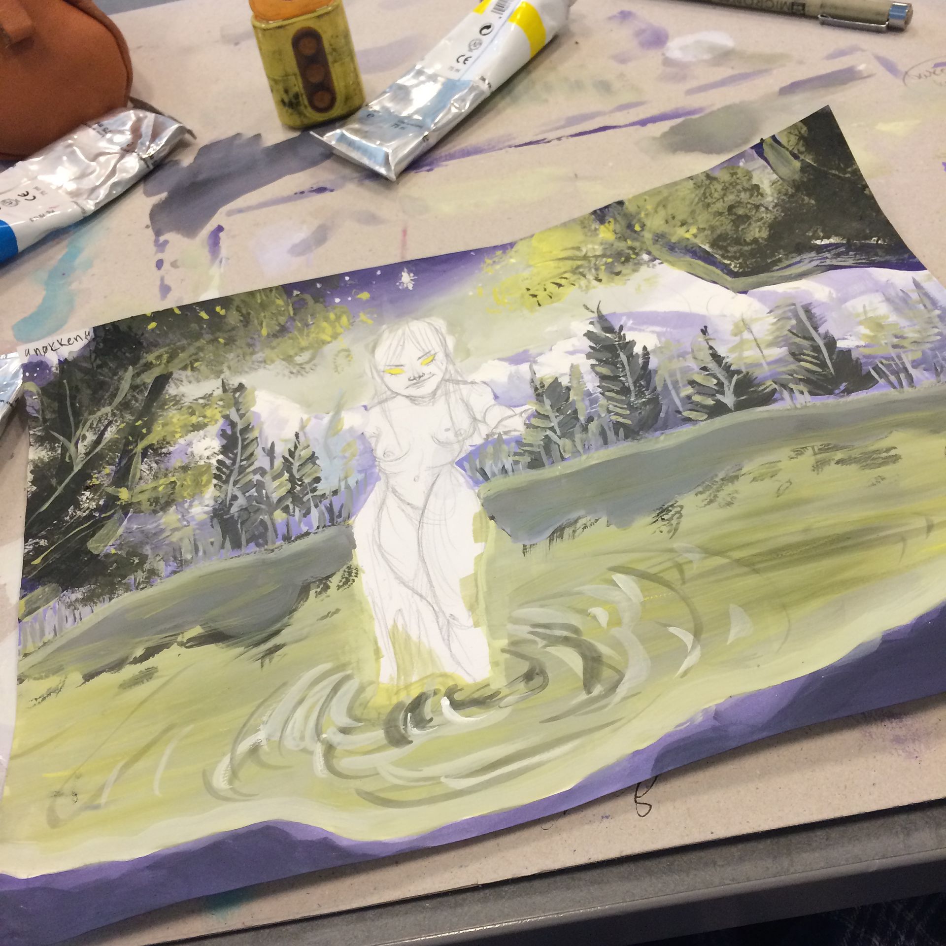
i struggled SO MUCH with the water and reflection UGHH I CANT PAINT
its 12:25am, goodnight😪😪😪
-zoo
Bạn đang đọc truyện trên: AzTruyen.Top