Theme 3|Entries
Oiiii! I've decided that the winner of the previous contest may have their entry for the next one critiqued, but not entered in the actual contest to keep things fair and crap. Anywho, on with this.
MadisonClay4 with this monochromatic eye.
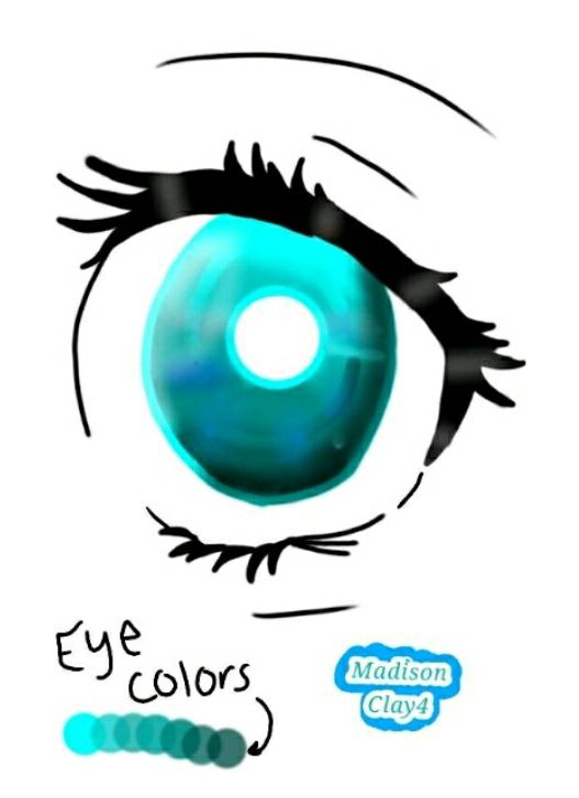
Ehh, but it's not fully monochromatic. Perhaps is, though, depending on what medium you use. Anyhow, theres not much to critique - but I'll critique what's there.
The eyelash anatomy is wonderful, but I'm assuming you used a reference. There's some unneccesary shine on the black part of the eye as well, as that's not how light would relfect off of that part. Onto the pupil/iris itself, the line work around the outside could be a bit neater, as well as the color blending on the inside. Another thought, I love your use of color blending, you could of spent more time on it, though, I think. Overall, the piece is nice in it's own simplistic style/way, though the lineart is quite messy.
Iamanewbiewriter13 with a monochromatic blue crying person.
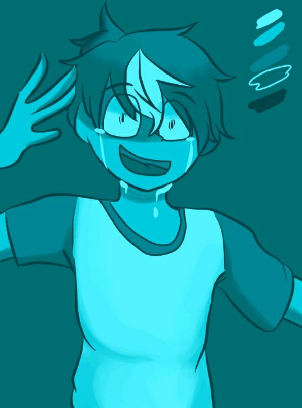
I (still) love your style and the fluidity of this piece. It really seems this could be a scene from an actual animation/comic. The anatomy is excellent, especially the hands. The shading on the clothing and skin are beautifully, almost perfectly done, and the library is very neat. The hair is also very fluffy and well done. The only flaw I could find is the fact that the hem of the t-shirt's thickness is inconsistent, really taking away from the niceness of it all. Overall, wonderful piece!
sarasa234 with a monochromatic howling wolf.
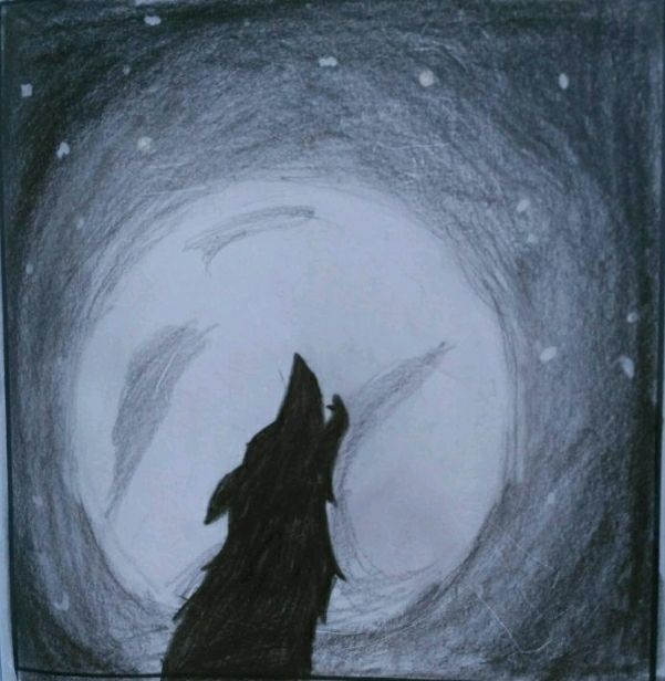
Ah, is this (at least the foreground) done in chalk? If so, ah, the memories this brings back! I remember when we did chalk in art class this year, that was interesting - and messy. Anywho, on with the critique.
The foreground is very neatly done, and there are no lines outside of the outline, though you could have filler it in better. The moon does not look very moonlike. Perhaps you could have added more craters of a smaller size, or just make it completely plain. A reference picture would do you good. The sky could be done more solidly, but I kinda like the sketchy design of the inner part. The transition from the dark in the sky to the light in the sky is excellently done, and my only other comment is the fact that you should have made the stars more of a set of controlled dots. Overall, a chilling piece.
FirestormNemesis with a monochromatic animal in a jar.
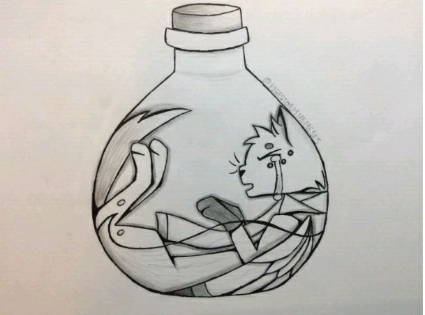
Once again, the lines are perfect! They both thicken and thin in the appropriate places. Something I do say is that you could have added more shades of greyscale, because it's virtually black, white, and a medium grey. Because of the lack of shades, this looks a little convoluted. The tail looks a little bit squished, as well as the wings. Also, the face (and the tears) look(s) a bit unnatural, especially the mouth - I feel it should be more open, perhaps. Other than that, the shading that you do have is amazing, along with the paws. I love the shading on the lid (quark?) of the bottle - it's perfect. Overall, this is a great piece that could use some tuneups.
@DerpyMelon246 who I can't tag with this yellow girl.
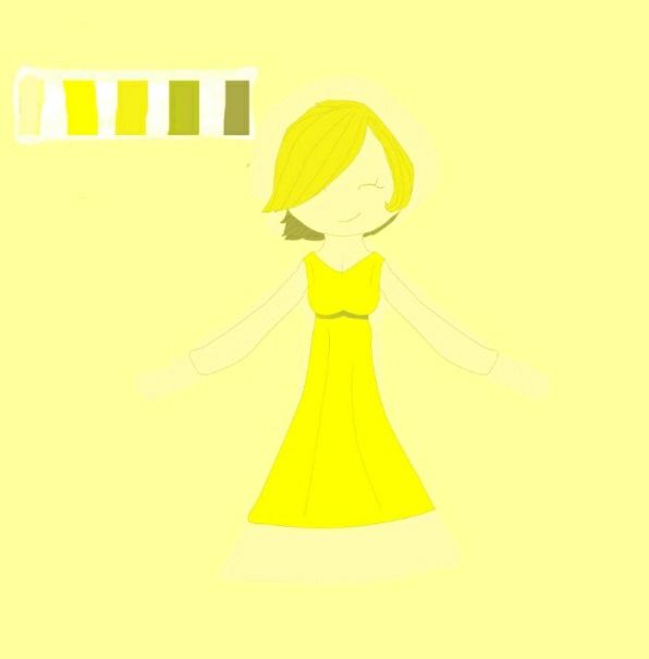
Excellent use of different shades of yellow! Working from the bottom up, the frill of the dress looks a bit unnatural, perhaps a bit to geometrical? It should poof slightly more, I think. The way the top of the dress falls into the bottom is perfectly done and the sleeves are nice except for one thing... Does this girl have hands? There's a lighter spot on the background where the hands should be, but I don't see individual fingers - if it's on me, please forgive, but still. Her head is perhaps a bit too round for my taste but I can see that this is stylized - also, by the way the hair is flopped, part of her right eye should be visible, yet it's not. Other than that, the neck is a little too thick. Overall, a nice piece that can use improvement.
Girlwithabeanie with (a beanie) monochromatic Big Ben.
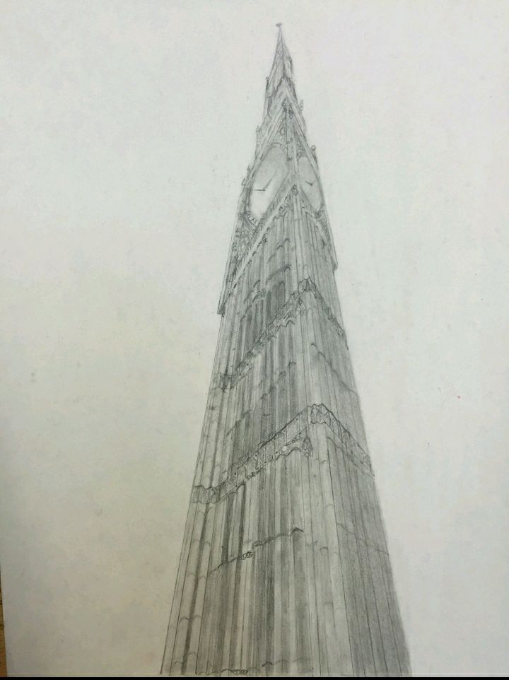
All I can say is...wow. I'm used to critiquing drawings of animals/humans so this one might be a bit short, as I do not know much about the structure of buildings.
Anywho, this is gorgeous. The finite detail you've added is wonderful, and I only have one negative thing to really point out - perhaps the shading could be a bit smoother. God, I'm sorry this is so short.
Speaking of which, god, I'm sorry this is so late. I'm a lazy procrastinator, and school is starting so now I'll have even less free time to procrastinate with.
So, the due-dates will not be one week from the initial day but two, and release dates won't necessarily be tied down to due-dates. Also, I'm taking away the prizes in general for these. I'm really sorry.
Now, I will show that by writing sorry a bunch.
Sorry.
Sorry.
Sorry.
Sorry.
Sorry.
Sorry.
Sorry.
Sorry.
Sorry.
Sorry.
Sorry.
Sorry.
Sorry.
Sorry.
Sorry.
Have you forgiven me?
If no, go to top of when I spammed sorry.
If yes, then-
can you pretty please give me some pointers on my entry? :3

Pleeeeaaase.
Also, for the competition, I'm only putting first place.
I'm so sorry for my laziness.
Bạn đang đọc truyện trên: AzTruyen.Top