Theme 2| Entries
Here are the entries for Theme 2. I will be critiquing it in two sections: relevance to song and quality of the actual drawing.
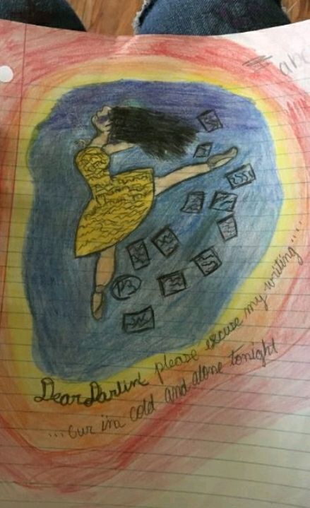
till_the_end_1 with Dear Darlin' by Olly Murs personified.
Ah, listening to that was sure a stroll outside of my comfort zone. *climbs back into my comfort zone of Vocaloid and Nightcore*
Art Critique: I love the fluidity and emotion of the piece! The anatomy is mostly good with some parts that don't make sense, such as the arms kinda dissapearing into the hair. I love how accurate the shape of the feet are, as I can't seem to get feet anatomy right no matter what I do. The face anatomy is well done, but I am rather concerned about the random splotch on the face right beneath the eye. It might be hair, but if it is, you need to make it more accurate. The coloring could be better, but it is well done overall. You should make the letters on the outside of the girl neater and mote consistant. Overall, it's a great piece, though it needs some work.
Relevance: This song does seem like so song one could dance to, but not exactly ballet. I love your inclusion of the letters, however, and the song lyrics. If I understood this right, this song is about a break-up, so you should have included some elements of that.
MadisonClay4 with Gypsy Bard.
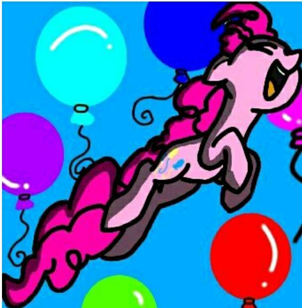
Art Critique: I like how solid the coloring is. The line work is nice, if a bit confusing at times (i.e. the loops in thr hair). The anatomy is perfect, besides, perhaps, the face, which is a bit too round. The eye is a bit confusing as well. If it's closed, why are there two lines? If it's open, wherr is the pupil/iris? The shading could be toned down a bit because it is a little overdone, and it seems the light source is below the pony, but I do not know if that is simply what you had in mind. Despite the fact that there is no lineart on the balloons, I think the background fits in nicely. Overall, great piece.
Relevance: I just listened to the song and, being one who doesn't watch my little pony, I am confused. The piece overall expresses the happy tone of the piece well, but perhaps you should have included a hint of a darker undertone.
TheSpartanCoffeeCup with I Will Survive by Gloria Gaynor.
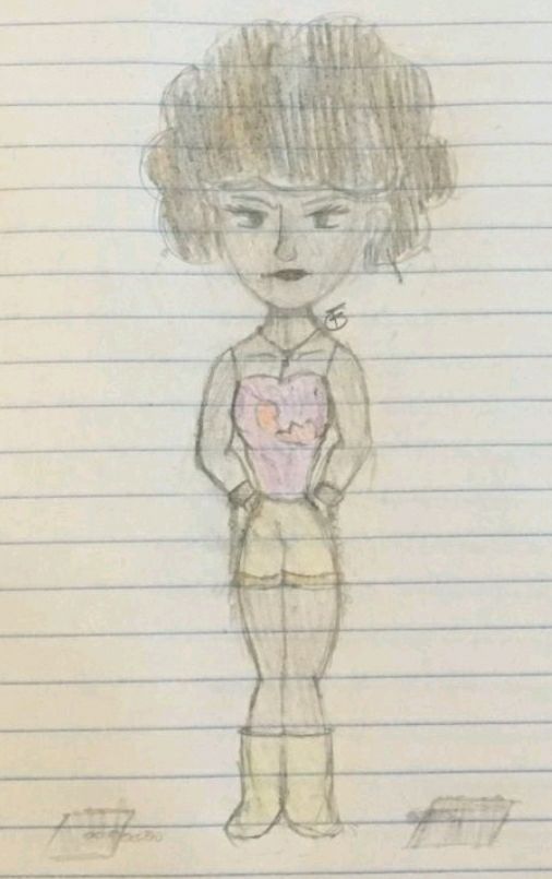
Art Critique: You have the anatomy of your style down besides, perhaps, the feet. To make them more natural, perhaps you could draw them longer. I don't know. The feet just seem to clash with the rest of the piece. The coloring around the skin could manage to stay in the lines more, but said coloring is neat overall. The hair coloring could have had a lot more time spent on it, and you could manage to make it a whole deal better, proven by the coloring of the skin. Trying to differentiate the hair and skin coloring is an applaudable skill, but one you shouldn't try until you're more advanced in artistry. In the end, it's a nice stylized piece that could use a little bit more work.
Relevance: I don't see any relevance to the song besides the fact that the figure looks vaguely like Gloria.
sarasa234 with Demons by Imagine Dragons personified.
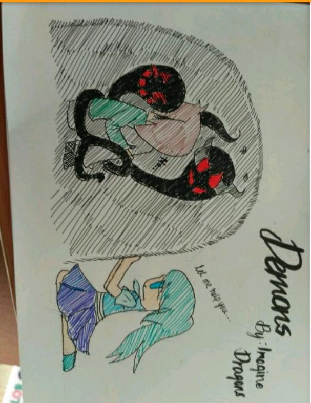
Art Critique: I absolutely love your style and how you did the coloring in this piece. Starting with the 'demons' around Figure 1, I love how you designed them, but the coloring could manage to be a bit more neat; I think you should have went for solid and fully colored in black with those. You've got the pose on the first figure down, but the hair looks a little lopsided: The random split in the middle is not needed. Now that I'm on the topic, the other figure's hair looks a bit unnatural. Her ponytail is sticking out a bit too much - it should be laying on her back. Her leg, as well, looks a bit wonky, as it's far too long. Overall, great piece, but could use some minor adjustments.
Relevance: This works really well with the plot of the song, and you really have the meaning down. It applies perfectly.
FirestormNemesis with Endstone Personified.
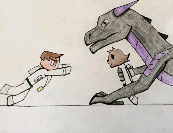
Art Critique: Again, I absolutely love your lineart. It thickens and thins appropriately, and it just overall adds a whole lot to the piece. The figure on the left is very well done with the anatomy, a fluid pose and the coloring - it's very well done. The dragon on the right looks a little awkward and I've grown to believe it's because of it's eye. Perhaps you could adjust it's placement on the face. It's arm could also start out a little thicker so it looks more dragon-like and less stiff. The figure the dragon is holding is overall average - the anatomy and coloring is well done, along with the expression being fine, though the head shape kind of looks like a fish. Overall, a very nice piece.
Relevance: Woah, that song was deeper than I thought it would be. Anyways, your drawing fot very well to the song - there's not much else to say: you drew a scene from the video.
howellinternet with Crybaby by Melanie Martinez
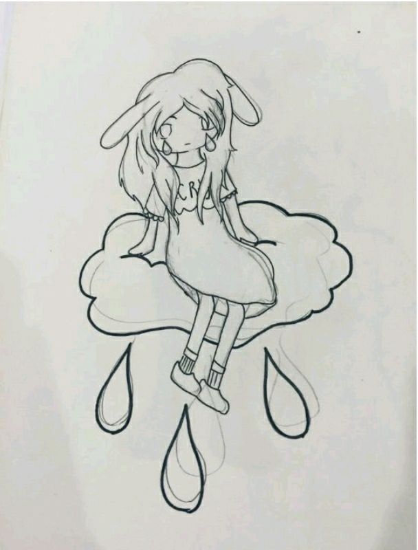
Art Critique: I don't have an overall thing to comment, so I'll just start with something random. First thing first, you should have erased the sketch more - as the pencil lines really take away from it all. I love how you did the hair - it works as hair should work, but the rabbit ears (?) are placed a little awkwardly, as rabbit ears usually have a joint. The face is really well done, but the teardrop should probably be done in a different style so they aren't too distracting. The neck and shoulders are beautifully done, yet the arms should be a bit longer and the hands a bit smaller. The opening of the dress should be redone - and I can't quite explain how, as it's hard to put into words, but maybe you could look up a tutorial. Also, the feet should be facng forward, not sideways. Overall, it's a great piece that needs some more attention drawn (get it?) towards anatomy.
Relevance: I love your taste in music, first of all. Anyway, this applies well, and I like your use of teardrops.
Moonsetta_008 with Just the Way You Are by Bruno Mars personified.
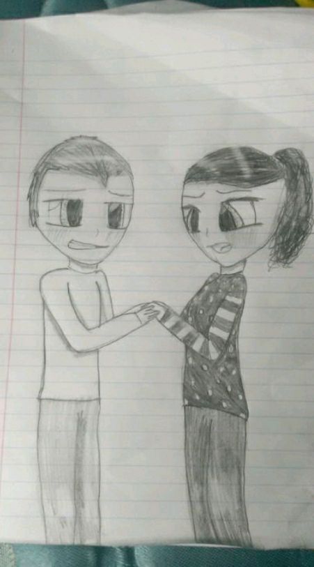
Art Critique: The first thing my attention is drawn to is the hair on the woman. A tip about hair for all beginning artists - it grows from the side of your head as well as the top. The facial expressions are really well done, if a bit misplaced. You could work on the shading, especially around the pants on both figures and the woman's shirt. The shoulders could be a bit thicker, as well. Other than that, you should work on the hands too, as they look a bit mangled. Overall, a nice piece, though.
Relevance: Eh... Not the kind of music I listen to. Still, your piece applies wonderfully.
NekoZiggy with She Had the World by Panic! at the Disco
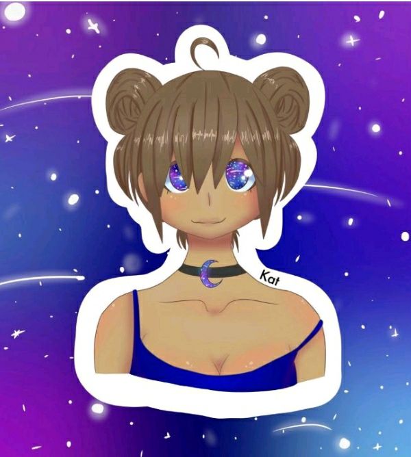
Art Critique: Once again, your shading and coloring is excellent, as well as your anatomy. The hair is much better and much more natural looking in this piece, and the face is really well done, especially the eyes. The clothing looks natural as well, with, again, the anatomy being really excellent. The only flaw I could find was the placement of the necklace, which should either sink down a bit more or rise up to be more of a choker. Overall, a wonderful piece with hardly and flaws.
Relevance: I love this band! Uh, anyways, your piece applies to the song really well, and there's not much else to say. You captured the moment perfectly.
Me with Wine Red by The Hush Sound Personified.
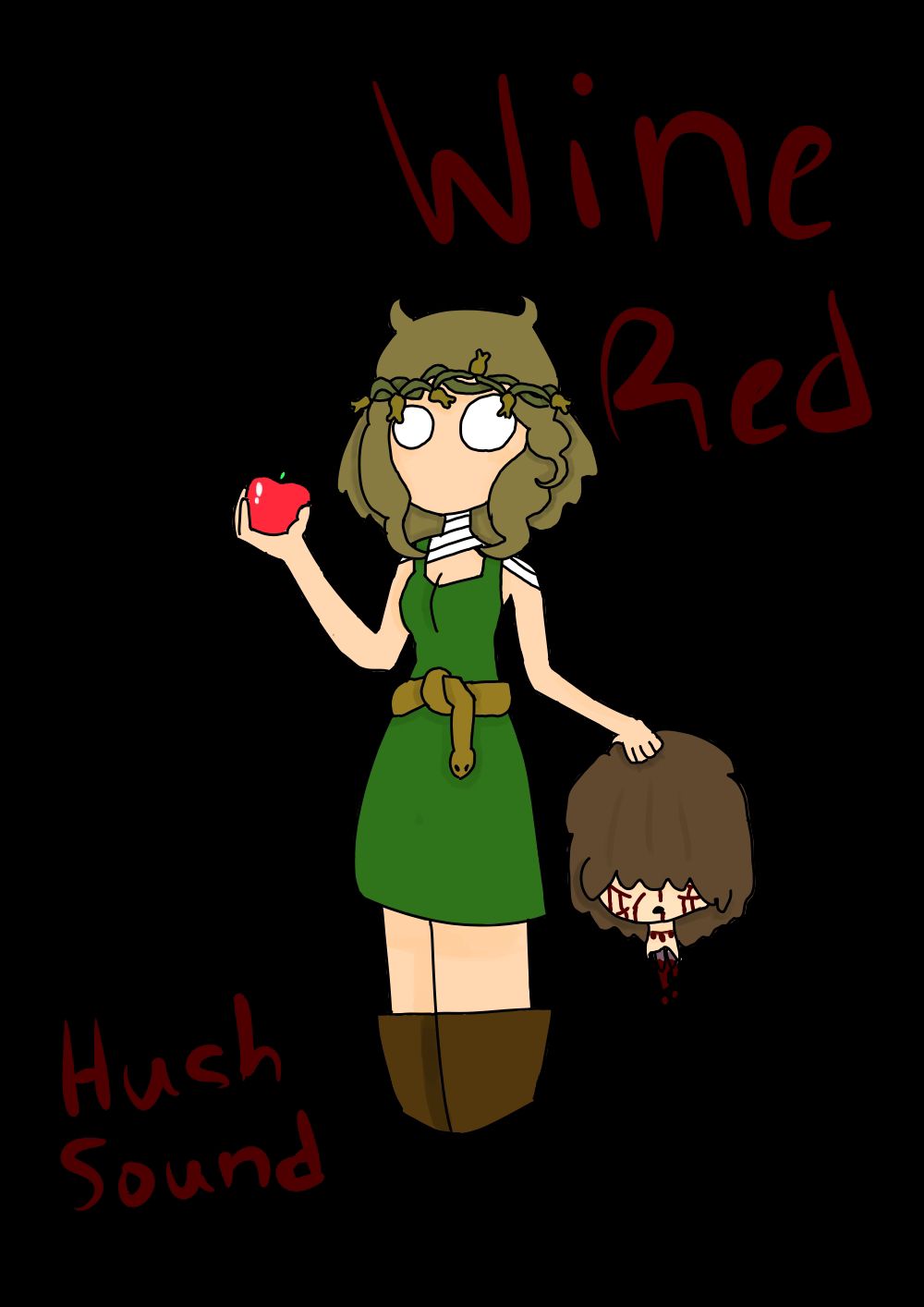
Severed heads are wonderful. Anyway, this is my piece. It's not as good as half of yours, but perhaps you could give me a few pointers/praises.
Bạn đang đọc truyện trên: AzTruyen.Top