Theme 1| Entries
Hello! These are the entries and critiques of the first challenge. The due date is July Fifth, and the winners chapter will be updated July Sixth.
ThegirlheroWrites with a wolf.
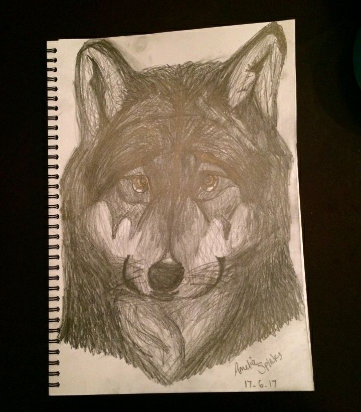
Critique: The original line work is evidently wonderful, and the differrnt types of shading (crosshatching, hatching, etc.) worked together wonderfully with the angle we are seeing the wolf. One flaw I would like to mention, however, is the wolf's eyes. They are cute and my problem isn't the fact that they don't fit in with the rest of the piece, but the white part of the eye is far too dark. Other than that, I couldn't really find any flaws. The highlights really are wonderful and add more to the piece. I love how, though it is still realism, it looks lile the wolf is smiling. The fur is very well done as well. Overall a really great piece.
KatelynKramer with a Melon Wolf.

Ah, I would like to note how different these all are going to be, and I love it. Overall the anatomy in these piece is really well done, and I have come to especially appreciate the paws because that is the thing I find hardest to draw on animals. The color palette is smooth, but perhaps more colors could have been added. Also, the way the colors blend into eachother isn't really how fur would work, even for a distinct style, and the only other flaw I could add is the fact that the eyes look asymmetrical and a little wonky. I do like the subtle use of fluff throughout the body. Overall, it works anatomically and it's visually appealing, yet there are a few fixable parts.
/Add a signature so people don't steal your wonderful work./
KatelynKramer with a personified wolf. (Wow, wolves are a favorite.)
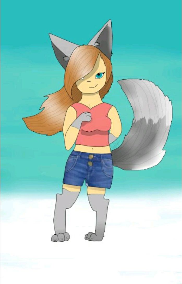
Ah, I like those ears. The shading and the persepctive work out wonderfully. Speaking of shading, yours is simply excellent. It's consistent and smooth. The lines in the hair and ears really add onto it. I love how you mixed the body parts of both a wolf and a human so smoothly, but perhaps you could have made the actual transition smoother so it wasn't cutting immediately to wolf/human. The shorts look out of place, and you either pasted a photo on, arranging and cutting it, or you added a strange amount of extra detail to the shorts. The chest lobs (boobs) are kind of uneven, and if she is turned the way required for such an odd angle, that would just be awkward. The highlights in the tail and hair are a bit random and distracting, and perhaps avoiding them all together is a better choice. Overall, it is quite original and visually appealing, though there are some flaws.
/Add a signature so people don't steal your wonderful work./
MadisonClay4 with a Sunflower Fox.
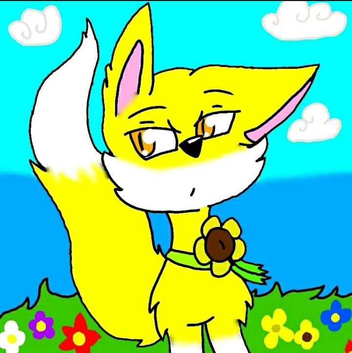
Overall, the colors are really bright and it definetely adds a layer of attention-grabbingness, and that's good. I love the smug look on her face, and plus, the coloring is mostly smooth. This is one of the few so far that added an actual background (not a color nor a gradient), though the background's style kind of clashes with the foreground's style. The shine in the eyes is overdone a bit, and the coloring is a little too smudged in places. The ears look like they belong on completely different animals in turn, plus, the eyebrows seem out of place. The lines aren't connected in some places. Do they not have a backside? The flower looks a bit unnatural, but I love the design of it, and the originality of the whole character.
/Add a signature so people don't steal your wonderful work./
Angelina (my cousin) with a rabbit personified.
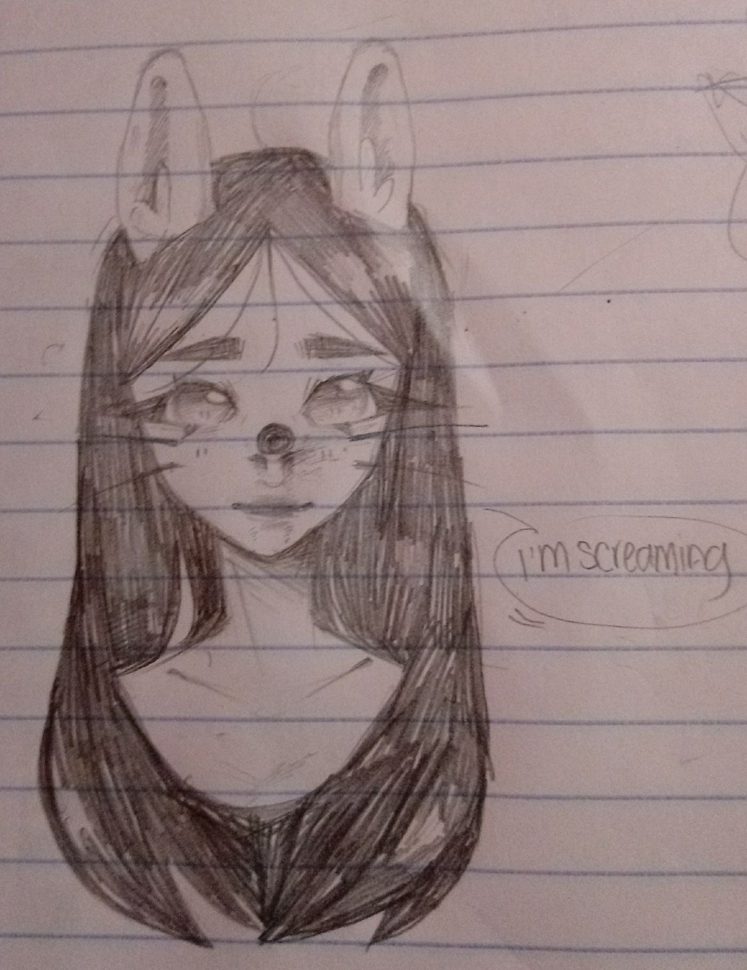
This is my cousin's entry and I don't have to critique it. I won't be biased for or against her.
/You should probably add a signature./
NekoZiggy with a bunny personified.
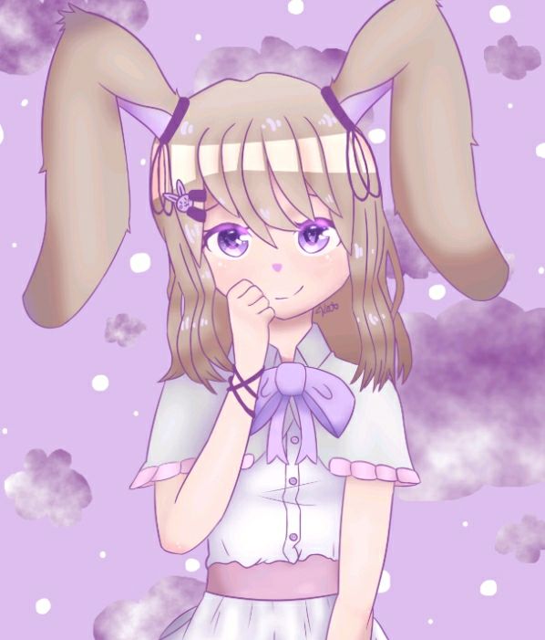
Overall, this is very visually appealing. The shading is wonderful in all places and the eyes are really (pun?) eye catching, and I don't say that just to make a pun. They're a deeper darker color and that really draws attention to the face, while the face is overall really...pretty, and the elbows, actually, are quite good. You've got the wrinkles in the clothing down, and everything there fits perfectly in with everything else, perhaps, disregarding the hair. The hair doesn't look bad or too out of place for that matter, but the way it folds looks a little unnatural. Besides that, the piece is really good, even including the marvelous background.
SophiaKate_15 with a bunny personified.
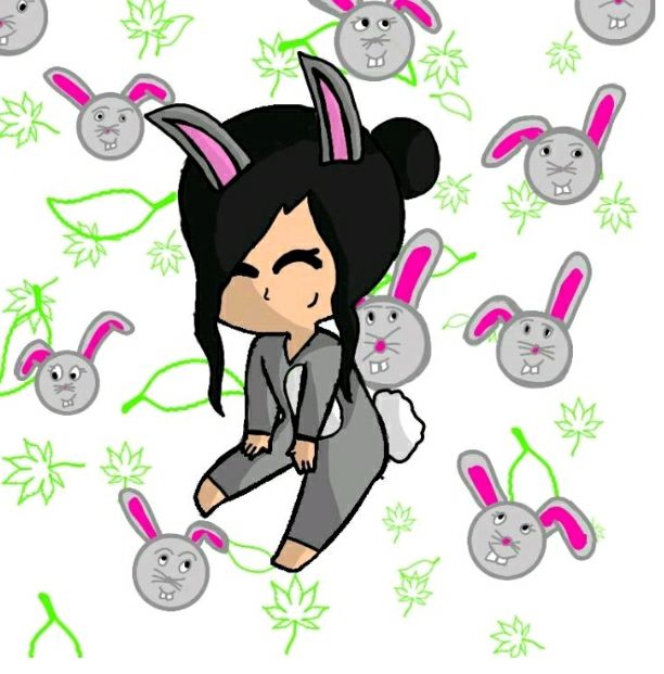
In this piece, the first appeal I notice overall is the shading. Sure, it's slightly different than what tons of other people do, but there's a clear light source, and that's something I miss most times. The bunny outfit is cute and this is the first humanoid entry to have an outfit resembling the animal as this clearly does. The face is cute and the hair is really pretty, bit the ears are off, and it's because these ears don't have a flop-over as I call it. Rabbit ears are supposed to have two sections, one that sticks up, and one that flops back down (see NekoZiggy's art) or they are on the side of the head (see Angelina's art). There are some straying black lines from the lineart and the hair, but they are hardly noticeable. The background is distracting and in a completely different style, and the bunny faces are all different sizes and all not-visually appealing. I think it would have been better to go with a solid color background.
/Add a signature so people don't steal your wonderful work./
sarasa234 with a deer personified.

The anatomy is the first good thing I notice because the combination of deer and person was executed really well. I recognize that this is probably some sort of style, but the neck throws me off a bit. The head looks like it belongs on a different body. The color palette overall goes together nicely/blends well, but it isn't the neatest of coloring. It isn't digital art, and it's a bit harder to stay in the lines when there's no undo button, but it could have been neater. The ears behind the antlers are so subtle yet I'm very glad you included them because some people, in drawing actual deer, forget that they have ears behind the antlers. Overall, good piece, and it's better coloring than I can do on paper.
/Add a signature so people don't steal your wonderful work./
Re: sarasa234 redid the piece, and the new piece is the one in the running.
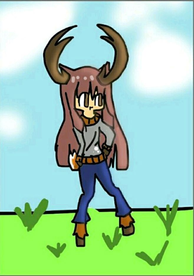
Again, the anatomy is excellent, with the execution of combining deer and human done really well. I'll list the things that stay the same: The neck still throws me off. The color palette blends well (though I might say it looks duller on this one). The ears are a nice touch. Now, for the differences. This piece lacks some detail just because the lines are so thick, and some of them are messy. The coloring is better, but the shine on the shirt seems out of place, and the background looks generally halfhearted. Maybe it's just my opinion, but I like the other one better.
Iamanewbiewriter13 with a chipmunk personified.
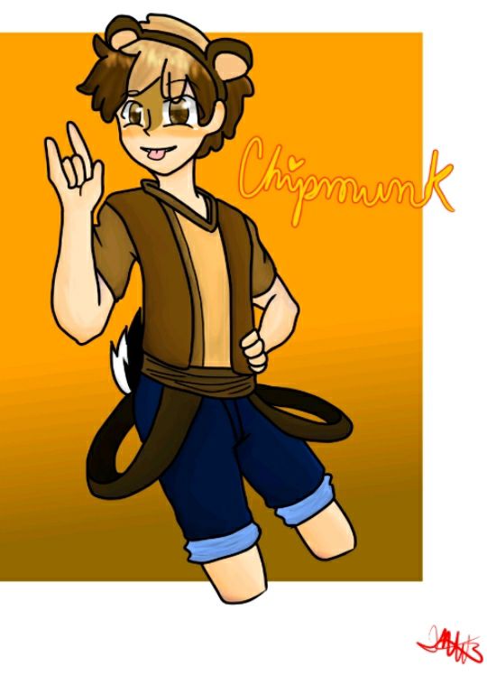
Overall, the anatomy is excellent, and the shading is correct. Personally, I can't get over how down pact the anatomy is in your style. One can really tell you spent time developing said style. Speaking of said style, the face doesn't quite fit the body, or perhaps it's just me. At first I had a problem with the dark marks on the top half of the face but my dad tolf me that was natural for chipmunks, so that's something I guess. The only other flaw I could find is the fact that the tail and the hair/ears aren't the same color. Speaking of the hair, the texture is wonderfully done and it flops correctly. Overall this is a near perfect piece with some styling choices I disagree with.
FirestormNemesis with a dragon/cat hybrid.
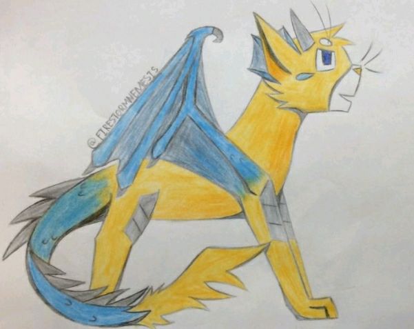
I love how smoothly these two creatures were combined, with the plates on the knees and everything. Both the coloring and the anatomy are great with only a few minor errors on the anatomy side. It seems the head doesn't really fit with the body, but perhaps that's a style. The posture is unnervingly stiff, and in the future, I suggest you try more fluid poses - have them do something other than pose. The tail is in the best posture overall, honestly, and it's coloring and texture only add onto the wonderfulness. While the coloring is a little strainy (as to be expected of colored pencils/crayons), it just makes me generally happy in some places. Overall, while having it's flaws, this piece makes me happy. Your coloring makes me happy.
till_the_end_1 with a phoenix. (Okay, I think I spelled it right. I live in the suburbs of Phoenix/?/ so I should know. -.-)
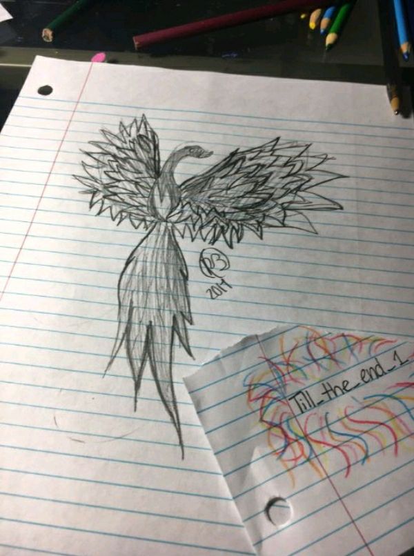
Ah, it looks so majestic! Onto the critique, I love the emotion in it's pose and how it wasn't just sitting there doing nothing. The feathers are nice, and I love the fluffy tail. I can tell you put quite the amount of work into it, yet there are still some flaws. For one, what I believe to be eraser marks are around the wings, plus, the whole thing lacks detail. I understand this is a sketch, so maybe if you go over it, more detail will be added. This specific critique is shorter just because of the lack of things to critique. Overall, this is a really pretty piece, but it lacks required detail.
My gosh! I forgot it was July Fifth completely! The winners will be updated in a few moments. Thanks for the patience. :) I hope to get more on top of time in the future.
Bạn đang đọc truyện trên: AzTruyen.Top