@tidally_locked
thank you for applying @tidall_locked !

PROFILE PHOTO:
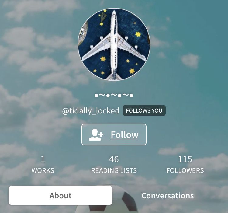
7/10 — i see what you're trying to do, but the colors and other embellishments are distracting and take away from the background.
PROFILE BACKGROUND:
7/10 — i like the sky picture, but maybe crop out the soccer ball? it's not on theme and it's distracting. also, choose one color of blue and stick with it otherwise there will be unbalance.
NAME:
2/10 — there's no name to call you! when you come up with a name, you can type it all uppercase in a cool font or all lowercase with cute symbols. also, choose a nickname. like if your name is elizabeth, choose Liza, Eliza, Betty, Bess.
USER:
9/10 — don't know what it means, but it's cute! maybe loose the underscore though.

BIO:
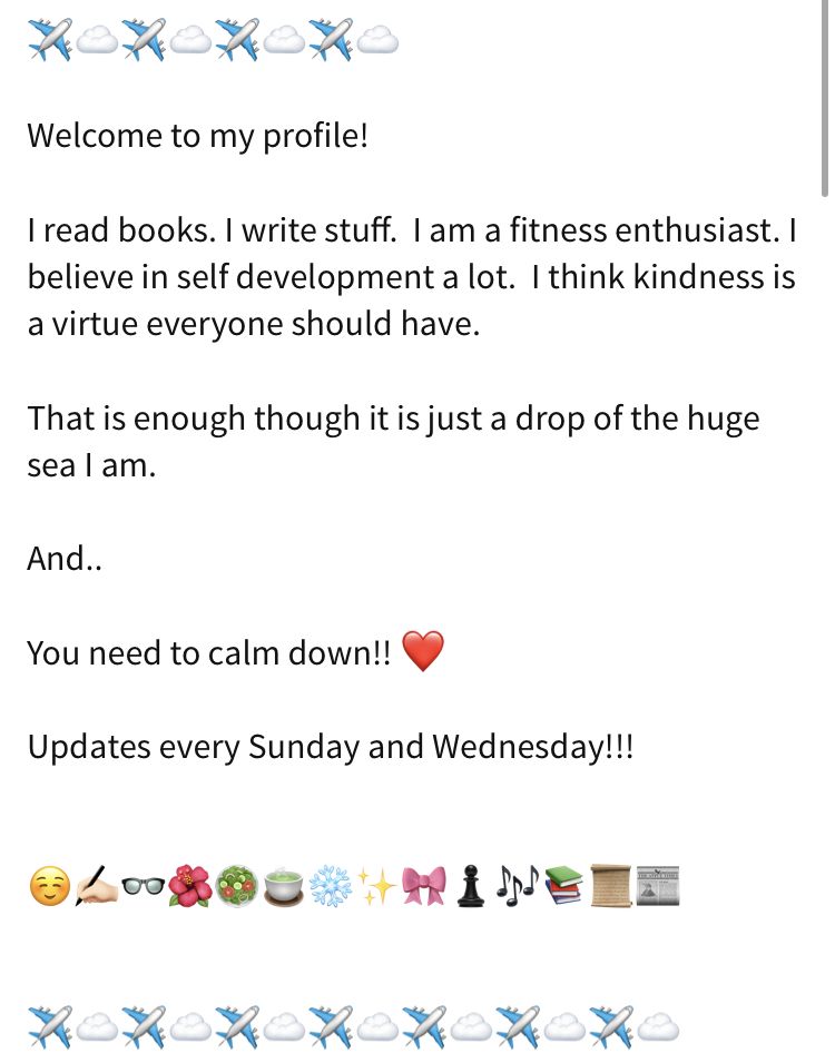
7/10 — there are way too many emojis. use words to express yourself! i personally like this format:
— NICKNAME! reading. writing.
fitness. anything. else. you.
want. someone. to. know.
" quotes can be in cool fonts too! "
but that's just me!

LOCATION:
10/10 — it fits your travel/plane theme!

COVERS:
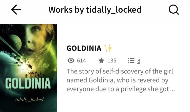
10/10 — there's nothing to compare it to BUT THIS COVER IS SO PRETTYYYYYYYY i'm in love. for your future covers, keep the same colors so that they look the same. also, the title shouldn't have an emoji in it. keep it plain for legal reasons.

READING LISTS:
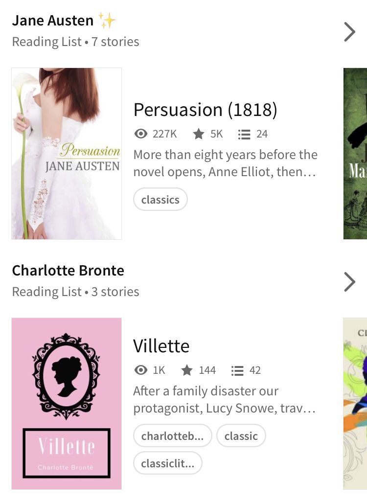
8/10 — play around with fonts and symbols! also, emojis should connect back to your theme so try 🌎, ✈️, 🗺
-
TOTAL
60/80 - awesome job!
please do not take your score to heart! this is just my opinion.
Bạn đang đọc truyện trên: AzTruyen.Top