@booklored
thank you for applying @booklored !
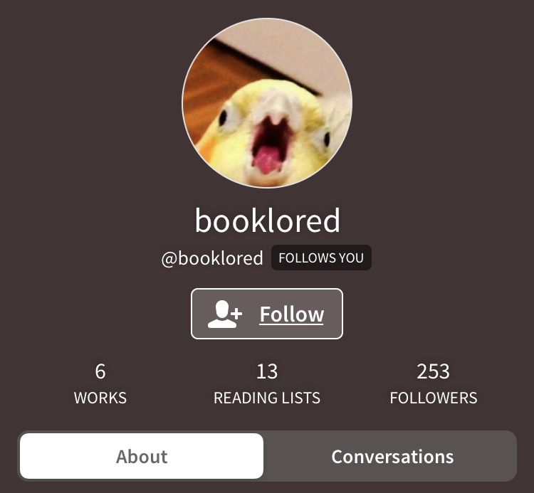
PROFILE PHOTO:
8/10 — super cute and inviting! if you are trying to have an aesthetic, though, you might want a less chaotic pfp. but that's just my opinion and no need it change it! if you are trying to look for a new pfp after, there are plenty of books on wp that offer icons!
PROFILE BACKGROUND:
8/10 — pretty simple but doesn't match your pfp. that's my only complaint but i like the simplicity of it compared to the chaotic pfp! maybe go for a light yellow? on picsart, you can enter your pfp into it and hit 'fit' and it will give you colors that match your pfp!
NAME:
10/10 — i have no idea what it means but i love it! short and sweet :)
USER:
9/10 — i like that it matches your name but i would add a dash at the end maybe? but it's up to you! it's great the way it is!
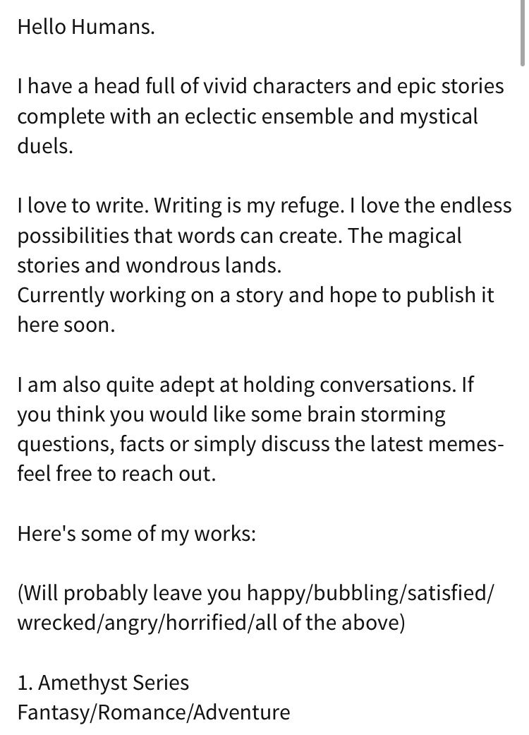

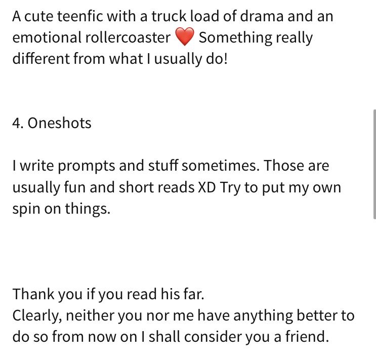
BIO:
6/10 — wayyyyyy too long. keep your likes short and maybe embellish with cute symbols (or don't!) but i would definitely consider making your likes seem shorter. as for your works, you don't need to put all of them, but if you do, group them by series. this makes it easier to read. by this i mean something like:
SUGAR BABY DUOLOGY
- Sugar Baby [1]
- Xavier [2]
but you don't need the summary in your bio. that's what your book is for! also, don't number your series and then number your books, it makes it hard to read.
LOCATION:
N/A score void !
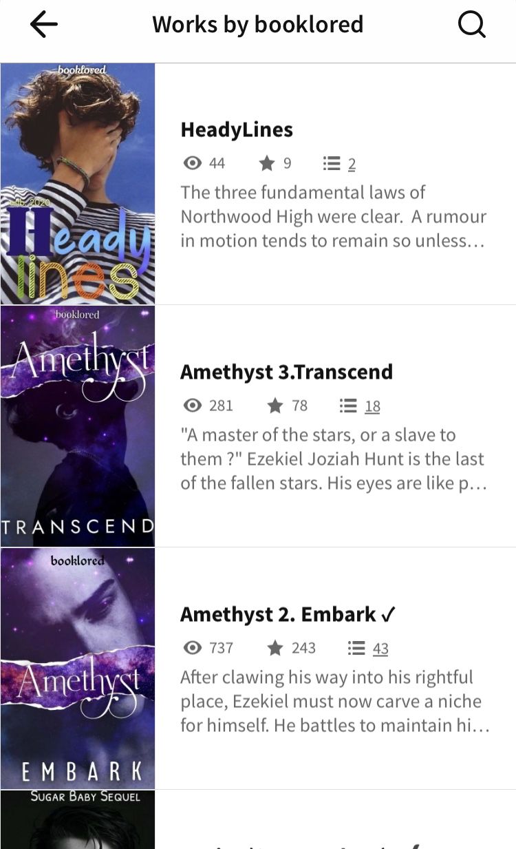
COVERS:
7/10 — these are good! they do not match your theme though or match each other. the series alone can match each other but the other books by themselves need to as well but on a subtle level. this is only if you want an aesthetic vibe to it, so no worries about them!
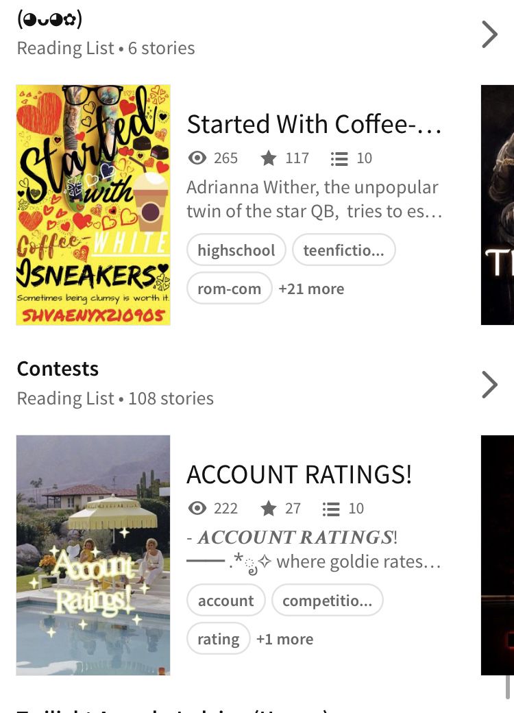
READING LISTS:
8/10 — you have more than one which is good and they show your interests well, but maybe make them symmetric by putting them in the same font (and you should put them in the same font as your name) or in all caps if you don't have a specific font. the symbols are cute but it would be easier to understand your interests if you have words to describe your lists. also, if you have symbols on one, you should have symbols on all of you want it to look cohesive.
-
TOTAL
56/70 - awesome job!
THIS IS ALL FOR FUN!! YOU DON'T HAVE TO TAKE MY CRITICISM SERIOUSLY!!!
Bạn đang đọc truyện trên: AzTruyen.Top