⟿ color theory

"T R A U M A"
..color theory.

˓ ִֶָ𓄲 ☁️ BEFORE WE START 𖦹 ࣪˖ ˒
Colors play an important role when designing, they can easily make or break your design's appearance. With colors, you can set a mood or attract attention. The right color scheme can create an ambiance of elegance and warmth, or convey an image of an eerie and dangerous scenery. But looking at a color wheel with so many possibilities can be really intimidating and overwhelming.
And even though this is a matter of taste (because something beautiful to me does not need to be beautiful to you too), there are some guidelines, that can serve as an orientation for you to achieve a color scheme which works for you and your design.
Just a little disclaimer beforehand, we all constantly learn new things and improve, I also still make mistakes and stuff. So this really is just me gathering a few infos from the Internet and sharing stuff that has helped me personally.
⛓
˓ ִֶָ𓄲 ☁️ COLOR WHEEL 𖦹 ࣪˖ ˒
The color wheel is designed to help us visualize the relationship amongst colors. There are many variations of the basic design, but the most common version is a wheel of 12 colors. It is composed of primary colors, secondary colors (the result of mixing primary ones) and tertiary/intermediate colors (the result of mixing primary and secondary colors).
But, let me explain all the components and some more information a bit further.
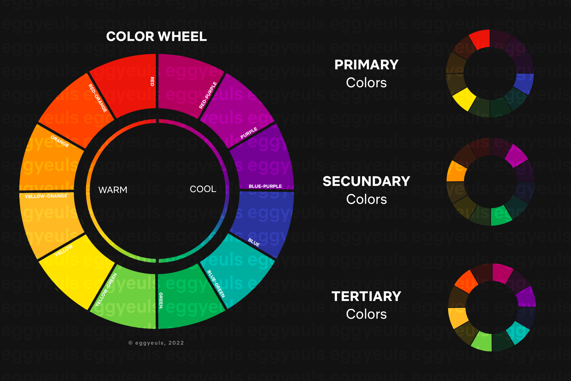
₀₀₁ primary colors:
(red, yellow and blue)
Primary colors can not be created by combining any of other colors. Instead they are the basis of all other colors on the wheel.
₀₀₂ secondary colors:
(green, orange and purple)
The secondary colors are created by mixing the primary colors. For example, mix yellow and blue to create green.
₀₀₃ tertiary colors:
(yellow-orange, red-orange, red-purple, blue-purple, blue-green & yellow-green)
These colors are created through mixing a primary and a secondary color — for example, blue (primary) and green (secondary). That is also the reason for them having a two-word name — such as "blue-green" for example.
₀₀₄ warm, cool & neutral colors:
Any colors with shades of yellow and red are considered warm. Whereas anything having a blue, green, or purple tint is considered a cool color. Neutral colors include black, white, grey, beige, and sometimes brown.
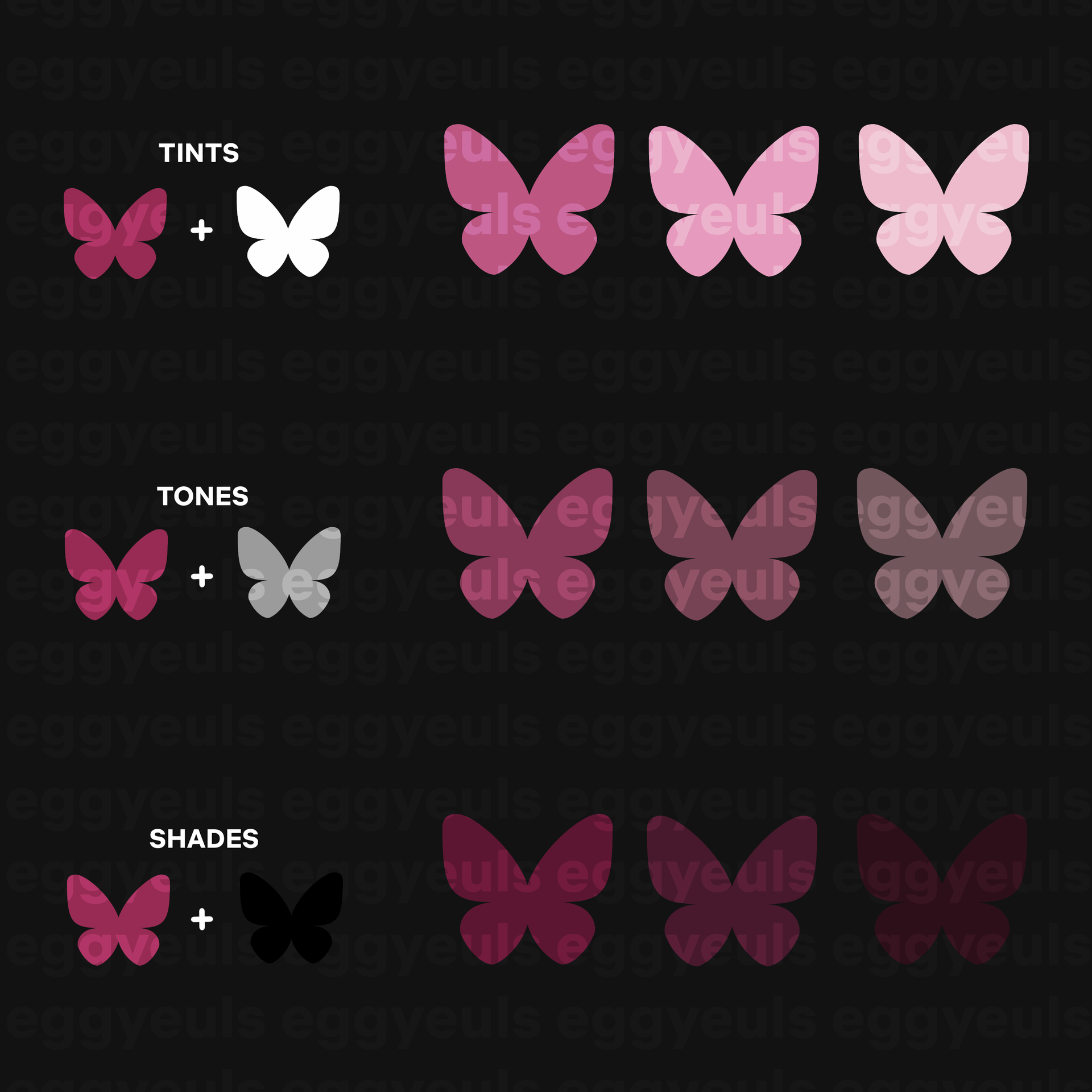
₀₀₅ shades, tints & tones:
"Shades" are results of mixing a color with black, in order to achieve darker versions of said color. The opposite of that, mixing a color with white in order to achieve a brighter version of your original color, creates "tints". And if gray is added to your original color, the result is a different "tone".
⛓
˓ ִֶָ𓄲 ☁️ COLOR HARMONY 𖦹 ࣪˖ ˒
As for visual experiences, "harmony" means that something is pleasing to the eye. Looking at it creates an inner sense of order and calmness, satisfaction even. But if something is not harmonious, it appears rather chaotic for example.
Down below you can find an overview and some explanations of different ways that colors can harmonize with each other.
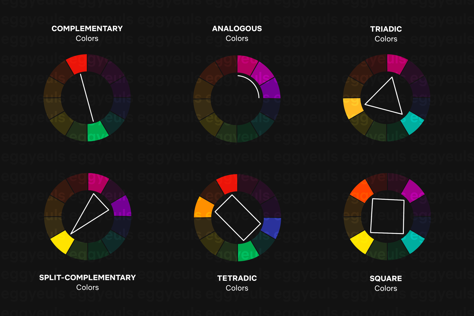
₀₀₁ analogous colors:
As for analogous colors, you simply choose any three colors that are side by side to each other. As for my example that would be red-purple, purple and blue-purple. But you need to make sure that you have enough contrast when choosing a scheme with such similar looking colors. Choose one color to dominate your scheme and a second one to serve as support. Then the third color is used along with black, white, or gray as an accent.
₀₀₂ complementary colors:
As for complementary colors you can choose any two colors that are directly opposite to each other. As you can see in my example, I chose red and green. The clashing contrast between these two colors creates a very vibrant look. But you need to be careful to not make this contrast too loud. Complementary colors can be quite tricky when they are used in large doses and work out way better when you rather just want to make something to stand out instead. Something complementary colors do not really work well for is text.
₀₀₃ split-complementary colors:
For a split-complementary color scheme you choose your base color and two colors adjacent to its complement. For my example I chose yellow as my base color, whose complement would be purple — but instead of purple I then go for red-purple and blue-purple, who are set right next to purple. Apparently a split-complimentary color scheme is recommended for beginners, as it is said to be difficult to mess up.
₀₀₄ triadic colors:
For the Triassic color scheme you can choose any three colors you like, but they need to be evenly spaced out. Which means, for my example, i chose orange-yellow, red-purple and blue-green — all of them have a space of three more colors between each other. Triadic color schemes tend to be quite lively, therefore the colors should be carefully balanced — choose one color to dominate and then use the two others for accent/support.
₀₀₅ tetradic colors:
For a tetradic color scheme you choose two sets of complementary colors, which results in 4 colors total in the end. As for my example that would be red and green for the first set, as well as blue and orange for the second set. Once again it is advices to choose one dominant color and use the rest for accent/support. But you need to watch the balance between warm and cool colors.
₀₀₆ square colors:
The square color scheme is similar to the tetradic one, you end up with four colors in total. But this time you can choose any four colors you want, complementary or not, they just need to be spaced out even on the color wheel. As for my example that would be purple, blue-green, yellow and red-orange. All of these have a space of two more colors between each of them. Unlike the tetradic, square color schemes can actually work well if you use all four colors evenly.
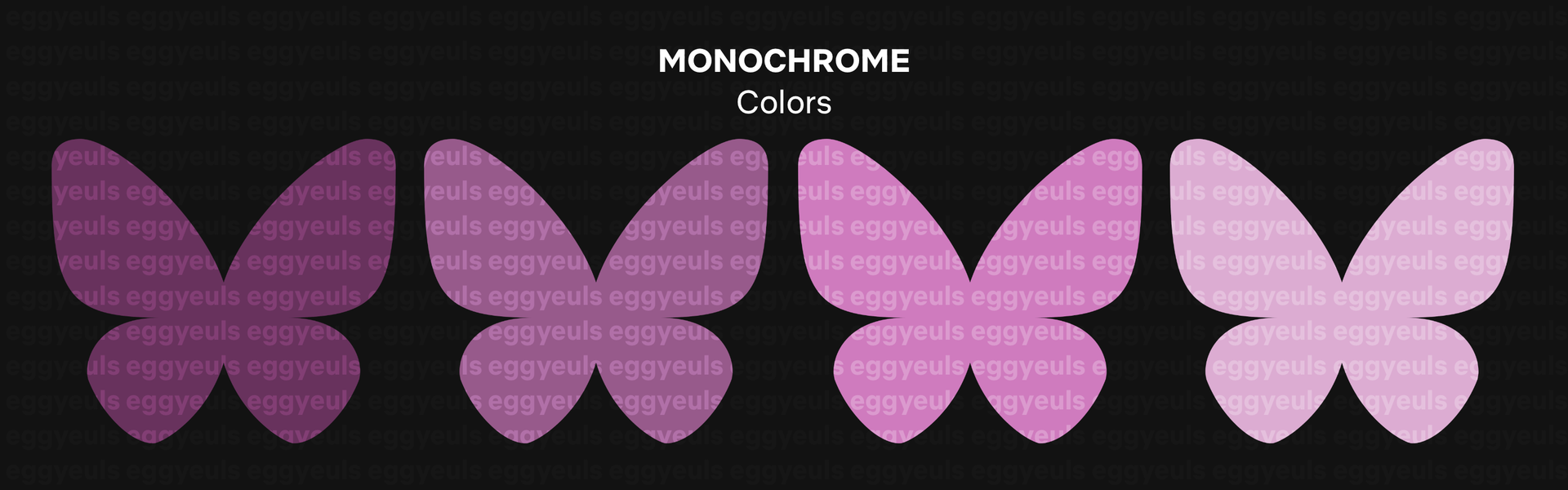
₀₀₇ monochrome colors:
A monochromatic color scheme is based on only one single color. All you do is using different shades, tones, and tints of your chosen hue — by altering the saturation and brightness of your base color (basically adding it subtracting white/grey/black).
⛓
˓ ִֶָ𓄲 ☁️ COLOR CONTEXT 𖦹 ࣪˖ ˒
We are basically just talking about how a color "behaves" in relation to one or more other color(s) and shapes. Down below is an example of how differently the red butterfly appears in relation to the background color.
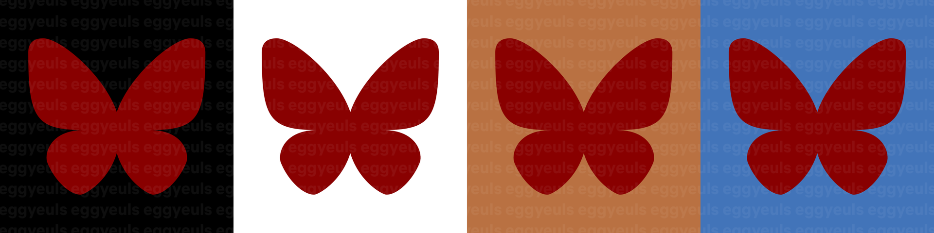
Again, for this example we have the color red as our test object. The red butterfly appears much more brilliant on a black canvas and rather dull against the white canvas. Red lighting and highlights therefore pop way more on a cover with a dark setting than with a pretty bright setting. In contrast with orange, the red butterfly appears a bit lifeless but in contrast with blue it rather pops off. If you look at this comparison example from a bit further away, you may even notice that the red butterfly looks bigger on the black surface, in comparison to the others.
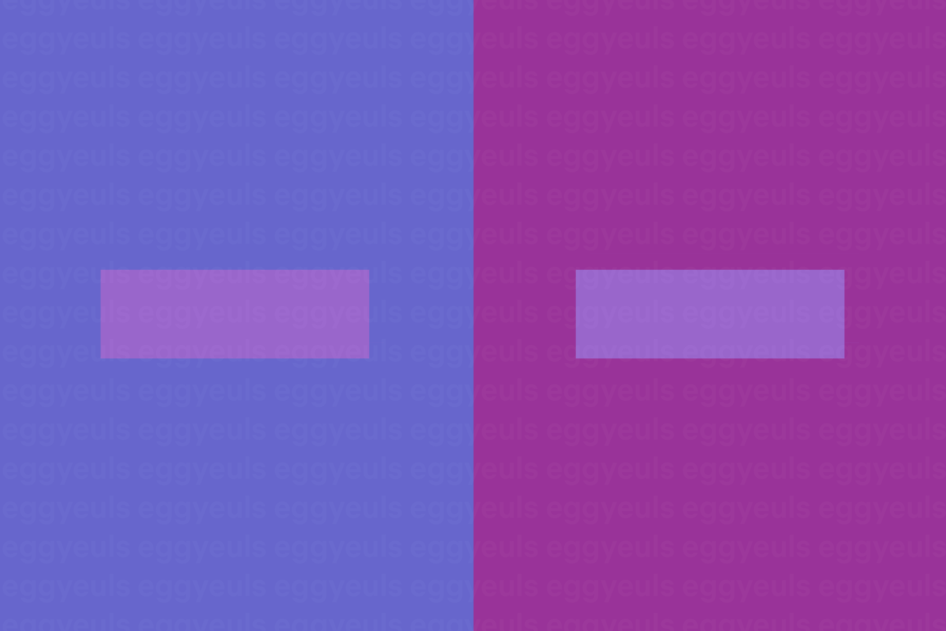
Now for this example we have a tiny purplish rectangle on top of two differently colored bigger rectangles. Keep in mind the tiny rectangles have the exact same color. Yet the rectangle on the left appears to have a red-purple tinge and the one in the right a rather blue-purple one.
⛓
˓ ִֶָ𓄲 ☁️ SOURCES 𖦹 ࣪˖ ˒
SOURCES 𖦹 ࣪˖ ˒
Down below is a summary of all sources used for this chapter.
₀₀₁ Text(s):
No external ones actually, everything said are my personal opinions/experiences
₀₀₂ Image(s):
All of them are my very own (intellectual) property
₀₀₃ Information(s):
https://en.99designs.de/blog/tips/color-psychology/amp/
https://www.interaction-design.org/literature/topics/color-theory
https://www.colormatters.com/color-and-design/basic-color-theory
https://medium.com/gravitdesigner/an-easy-approach-to-color-theory-and-graphic-design-8b9287c95e42
⛓
© eggyeuls, 2022
Bạn đang đọc truyện trên: AzTruyen.Top