entries
days left: over
✧ ⋆ · * . · . · · .
. . . · + · * ✫ * ⊹ * ˚
R O U N D T H R E E
entries pt. i
+ since it's a song cover based round, votes will be counted. SO MAKE SURE YOU CAST YOUR VOTES WITH MUCH THOUGHT! ALL PARTICIPANTS ARE MOTIVATED TO CAST AT LEAST TWO VOTES AS TEAM SPIRIT. (appreciative comments and messages won't be counted as vote so you can do that)
(person with highest '👑' will be awarded +1 for people's favourite entry) - pls don't vote for your own entries bimbos 💀 we don't appreciate narcissism here 😍
✧ ⋆ · * . · . · · .
. . . · + · * ✫ * ⊹ * ˚
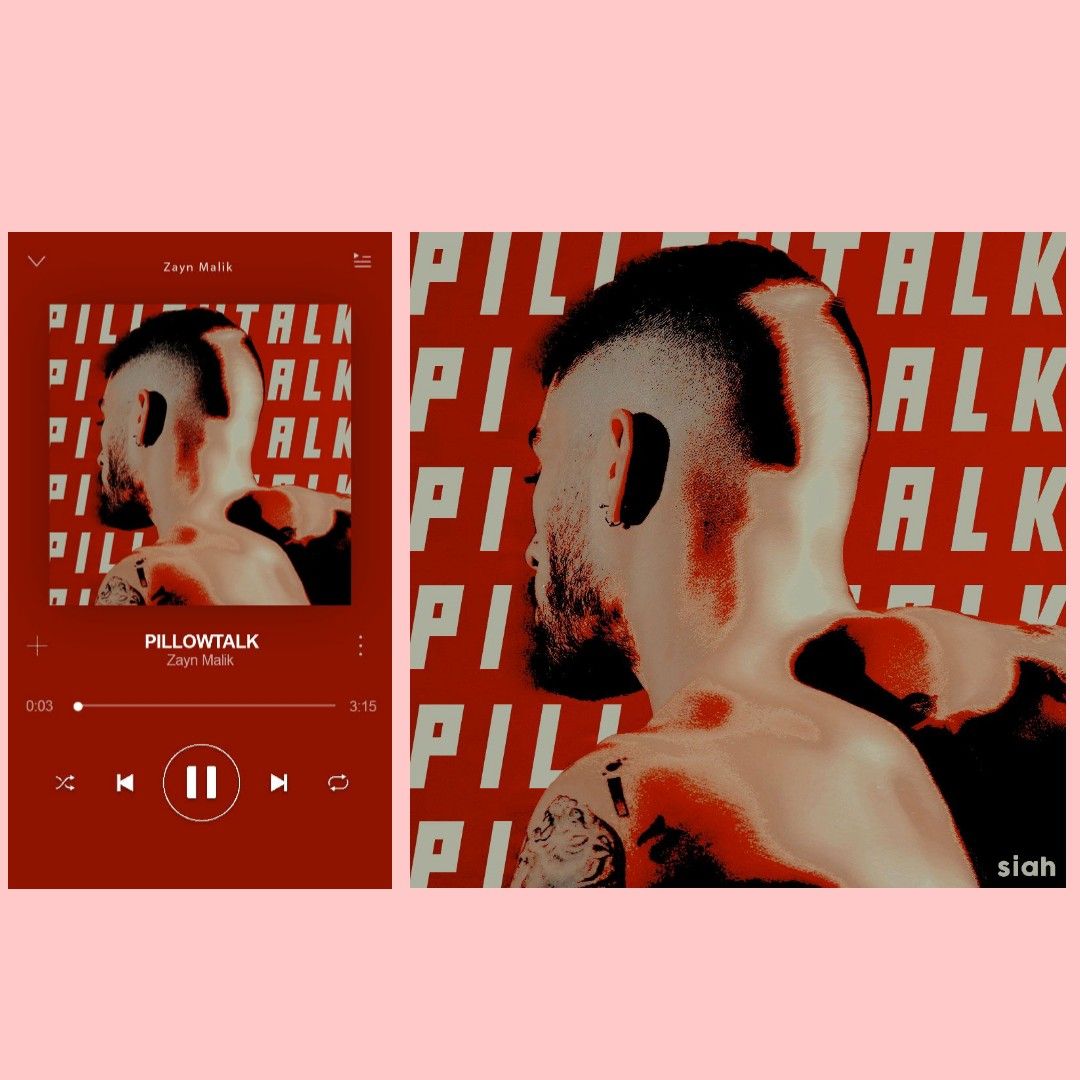
truly amazing! i rly appreciate the fact that you even added a funky touch by making an actual screenshot! (i made your entry into a collage so people could see both i hope you don't mind that) i rly dig the over contrast of the cover and the overlapping of zayn on the title. appears like a song cover. i wish you'd added the singer's name somewhere to tie it up but overall the colour scheme, the theme, totally goes with the vibe of the song and mv. amazing entry! x
✧
⋆ · * . · . · · .
. . . · + · * ✫ * ⊹ * ˚
2| eclairlalisa
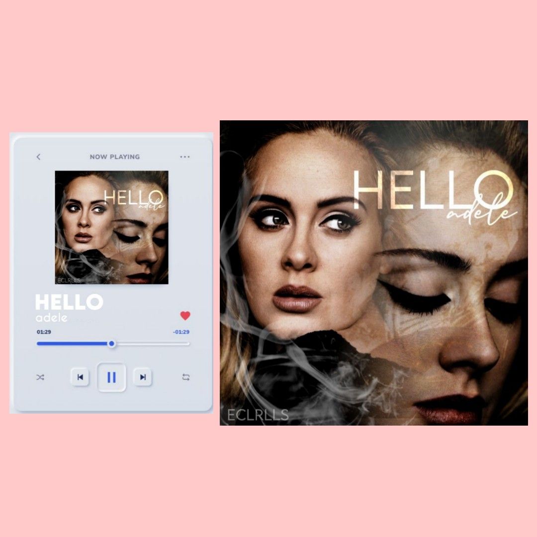
your entry looks amazing! hello is a very in depth and deep song and adele's vocals are 😍 and i think this captures it very well. the blending looks nice. i only have a slight problem with the title placement, it looks like it's placed haphazardly which makes it look more like a graphic than a song cover. but love the effort x you could've also tried a sepia filter to match the mv! but i rly dig this dark theme x
✧ ⋆ · * . · . · · .
. . . · + · * ✫ * ⊹ * ˚
3| Amochichi
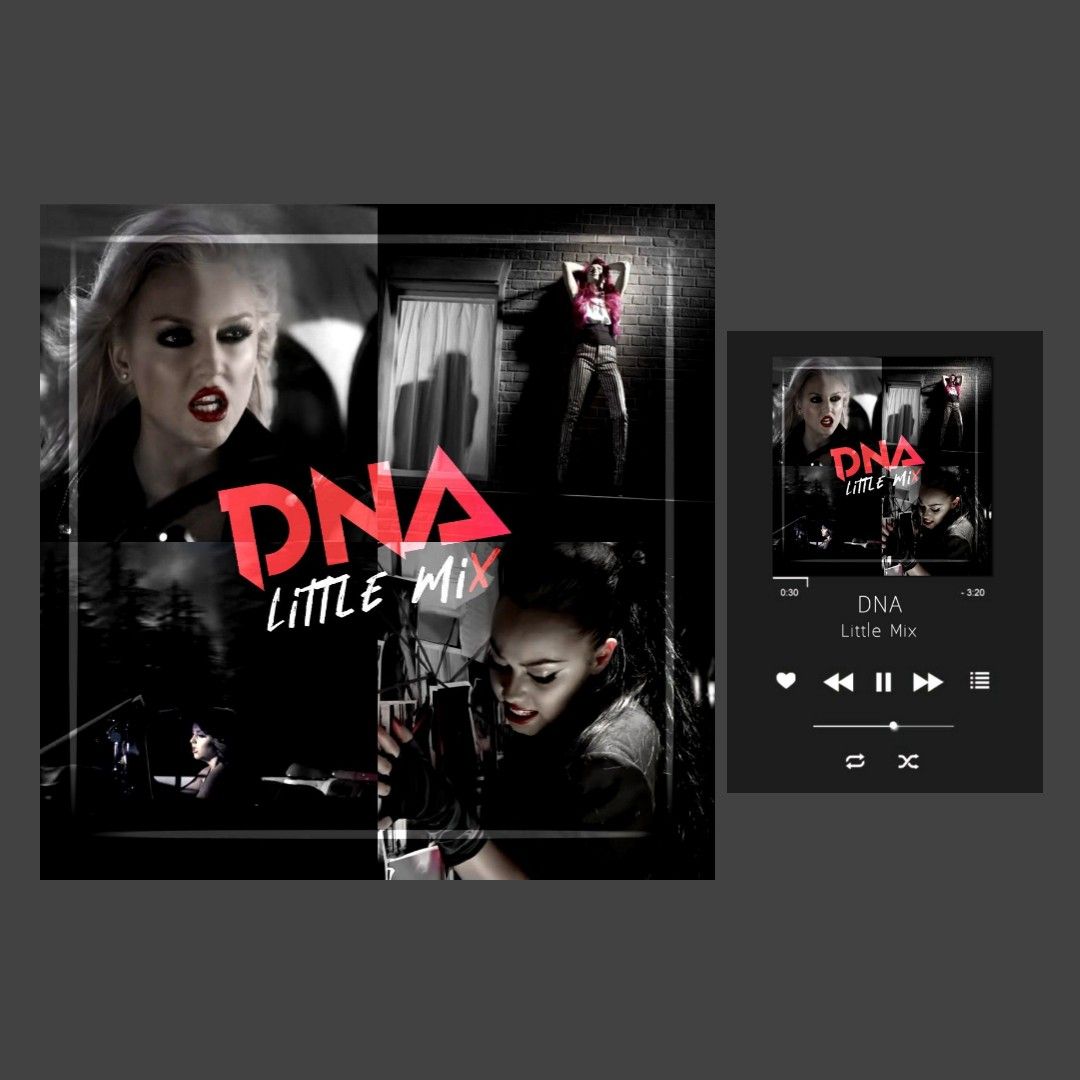
look rly cool! rly matches the mv (stills are from the mv i assume) i like the dark theme you followed to match the mv. the only thing is i kinda don't rly have much to point out since it's a v simple entry. there's nothing wrong in simple but i feel you could've done something more for it? i rly dig the font you used tho! X
. · . · · .
. . . · + · * ✫ * ⊹ * ˚
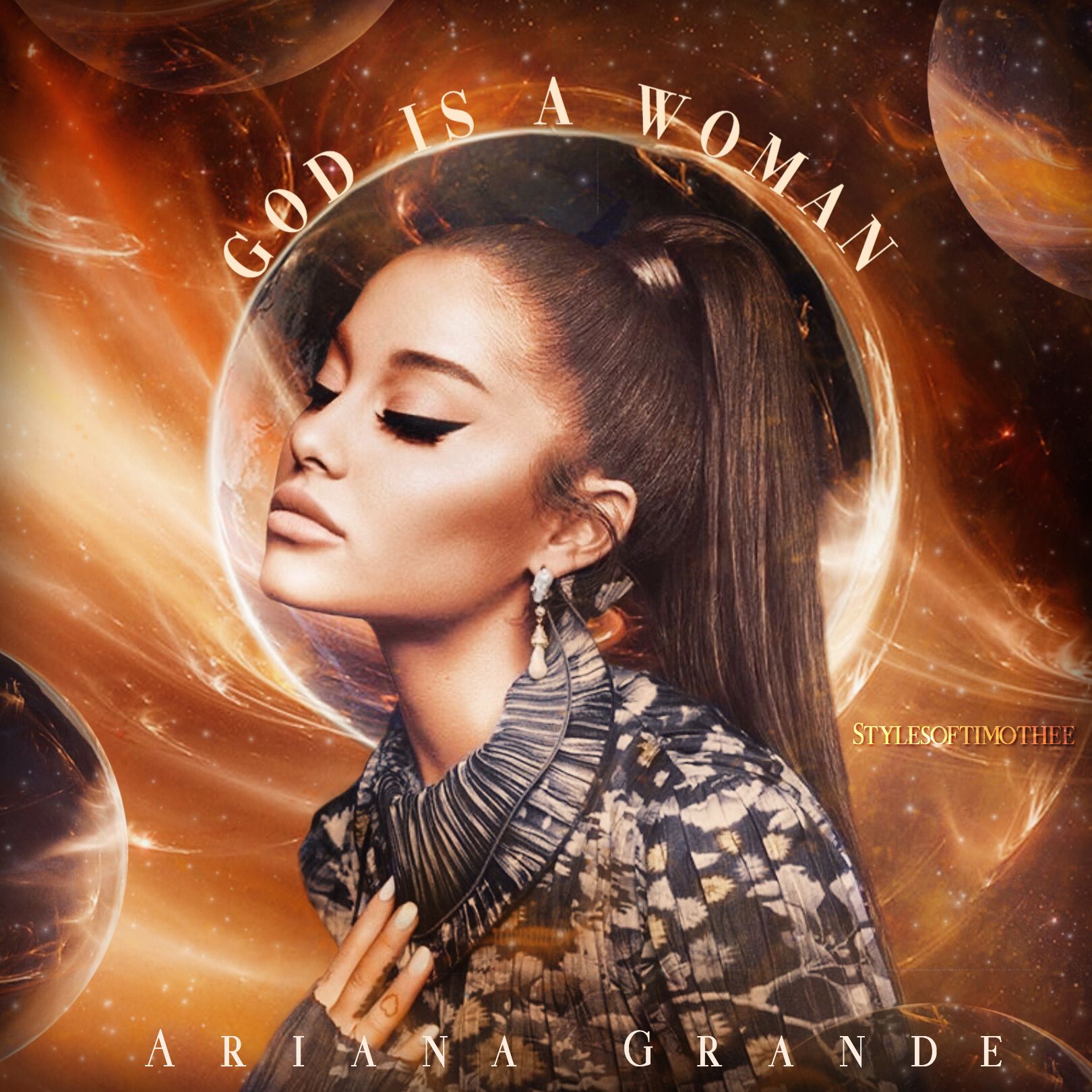
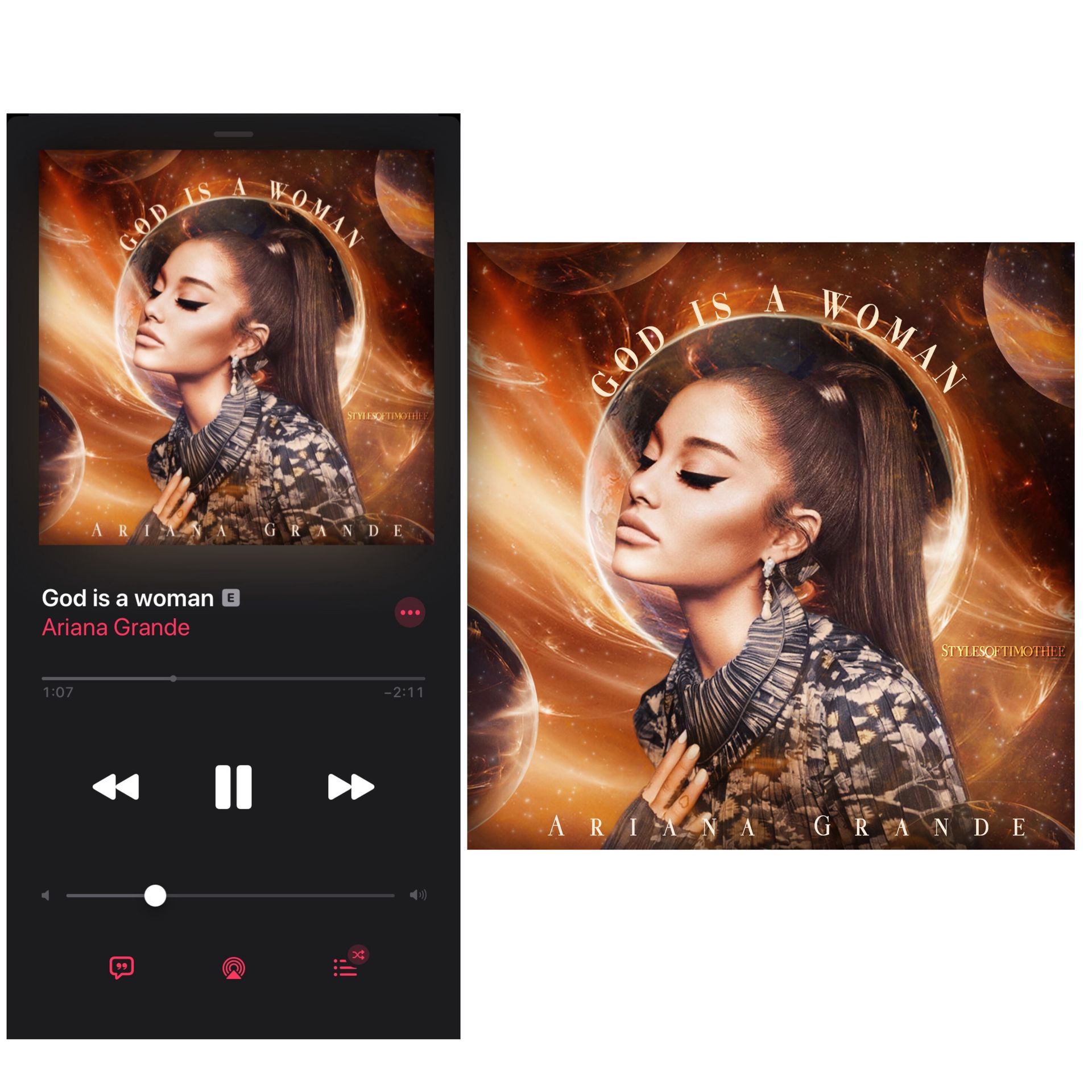
this is beautiful and majestic to say the least. i love the colour palette you followed since gold is a god-ly divine colour. the quality, the font everything matches and blends well together! i think i only have problem with the placement of text. while the title of track looks amazingly placed the singer name looks weird. maybe you could've added it below the circle in the same manner so it looked symmetrical? i love the entry tho x
✧ ⋆ · * . · . · · .
. . . · + · * ✫ * ⊹ * ˚
5| Milochondria
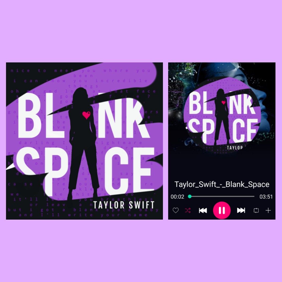
i love the purple-black theme you went with. the idea to use the silhouette sorta vector girl like the alphabet 'a' is so clever (idk if u tried for that or i just over analyse shít 😭)
i love how the background has the lyrics and the little heart has a bLaNk SpAcE (rly clever entry love it) x
✧ ⋆ · * . · . · · .
. . . · + · * ✫ * ⊹ * ˚
6| cloudyjimin
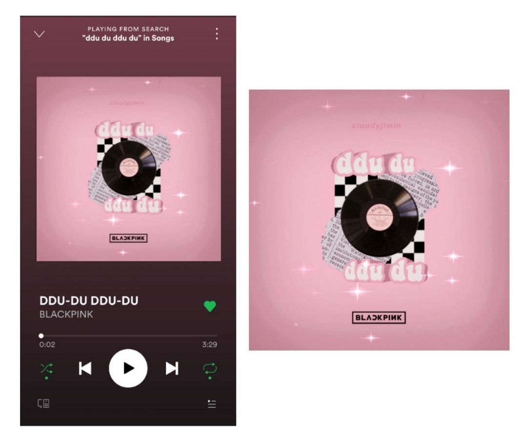
(firstly thank u sm for making a collage on your own it rly saved me some work 😔) i LOVE how minimalistic yet beautiful this is. the idea is rly cute and goes w black pink's aesthetic. i love the font of the song title and that you used the actual logo of the band. the light vignette effect looks cute too. great job! x
✧ ⋆ · * . · . · · .
. . . · + · * ✫ * ⊹ * ˚
7| xltmnx
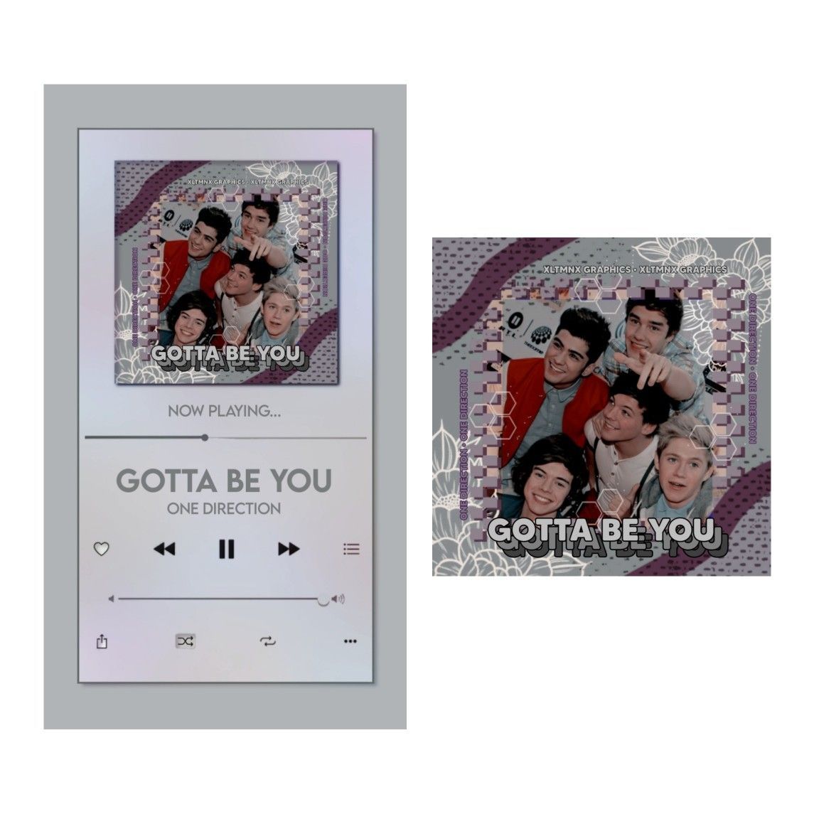
i love the way the title is written, looks very aesthetic and pleasing tbh. love it rly. i think you went a little too overboard with it, it looks more like a graphic edit than a song cover. also, gotta be you is a song that sort of deals with heartbreak or. . . more like the lads talking about the girl they want and the cover kind of fails to depict that. tho as an aesthetic it looks impressive.
✧ ⋆ · * . · . · · .
. . . · + · * ✫ * ⊹ * ˚
8| amygraphics
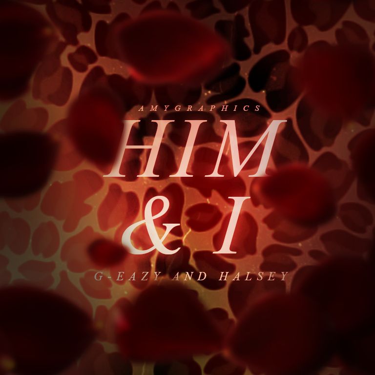
oof this looks beautiful in all honesty. i love the whole theme of the cover and it looks so real! i love how it gives kinda the dark-firy vibe like the song and how you took little details from the mv to incorporate them. great job!
✧ ⋆ · * . · . · · .
. . . · + · * ✫ * ⊹ * ˚
9| x_Ishita_x
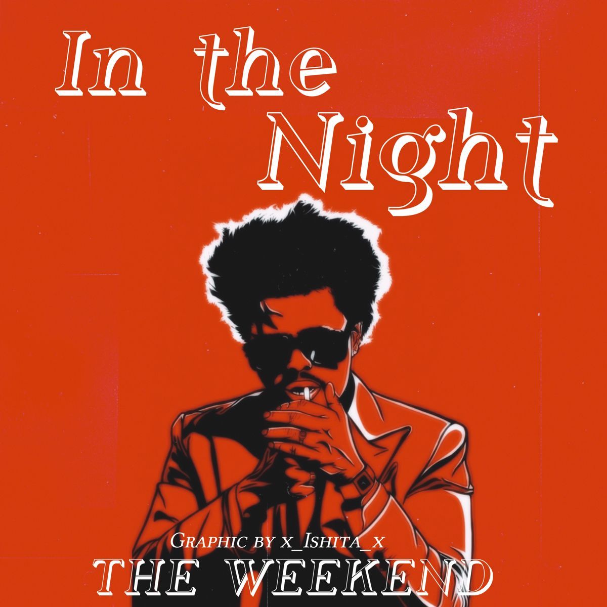
the edit looks amazing and rly aesthetic but i guess you could've done better with the font and the placement of the title and the singers name with your credits. i think placement is rly imp in graphics so that's what im kinda iffy about otherwise the whole vibe and red theme is cool!
✧ ⋆ · * . · . · · .
. . . · + · * ✫ * ⊹ * ˚
10| theasianidiot
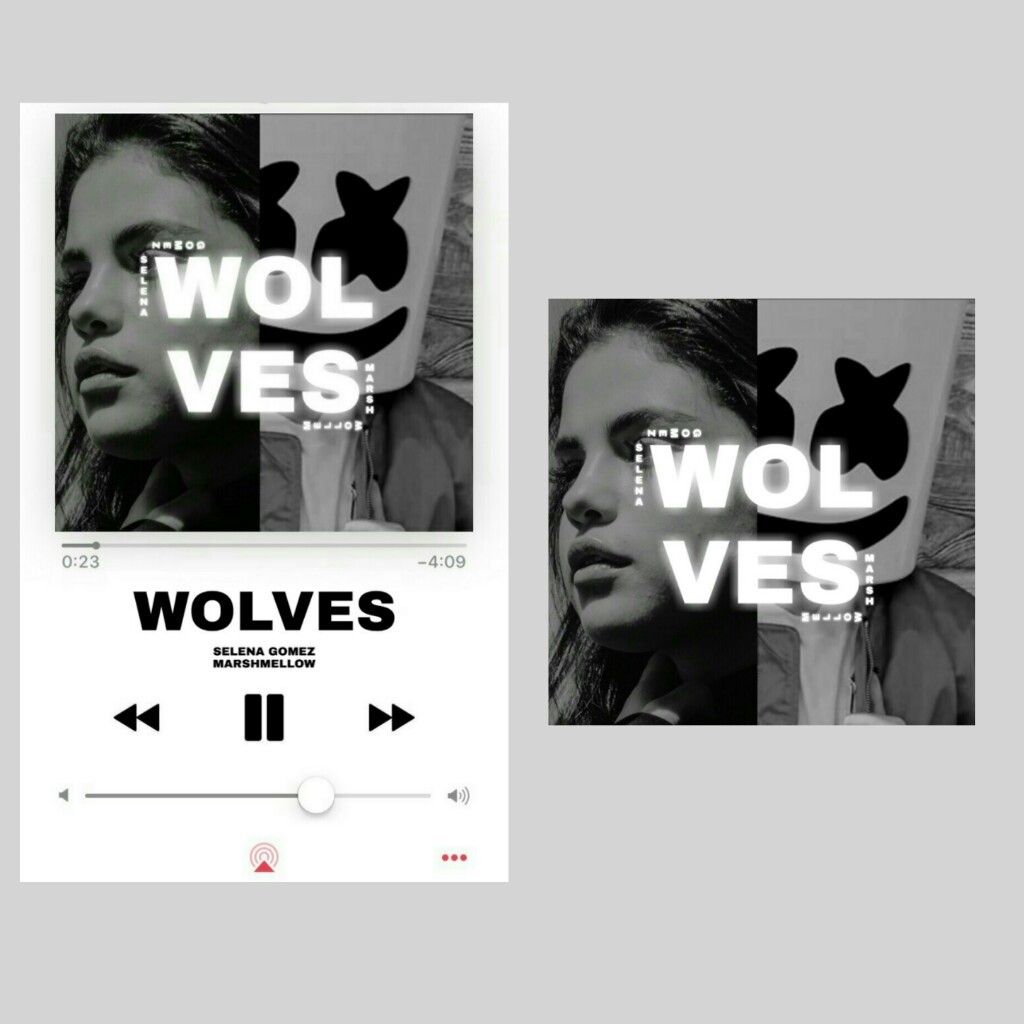
this is so eye catching for some reason. i love the simplicity of it, tho i feel you could've done a little more since the mv was selena serving totally with colours and popping out. tho i love the way the title is glowing the way you wrote the singers name. clever. i can't spot your username tho?
✧ ⋆ · * . · . · · .
. . . · + · * ✫ * ⊹ * ˚
11| vanezzari
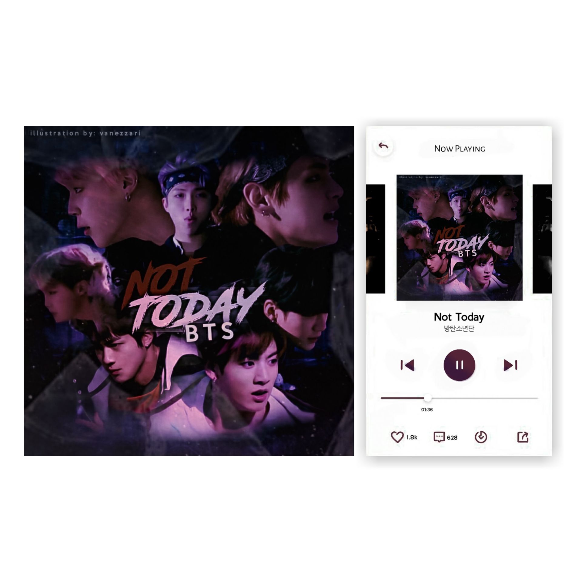
that's great that you decided to put in effort rather than take a group photo of them, slap the title on it and call it quits. anyway, i love the theme, the merging looks a little iffy in the bottom nothing major tho, the placement is good and i love the font you used!
✧ ⋆ · * . · . · · .
. . . · + · * ✫ * ⊹ * ˚
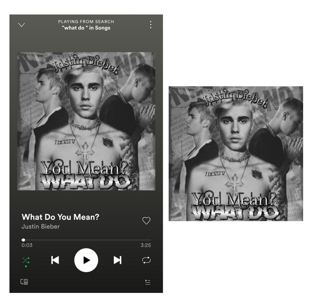
you went with the bnw theme which is great. i feel there wasn't a need to face swap, the picture you selected of jb was matching and looked great either way. it's clever to write the title that way but i think it makes it difficult to read for the audience, you could've gone with tilted words to enhance your point (just a suggestion) i also feel the font you selected doesn't match and merging behind is also unclean. you're an amazing graphic artist and ik you've got problems rn, im sure you'll do wayyyy better next round ❤️
✧ ⋆ · * . · . · · .
. . . · + · * ✫ * ⊹ * ˚
13| vernil
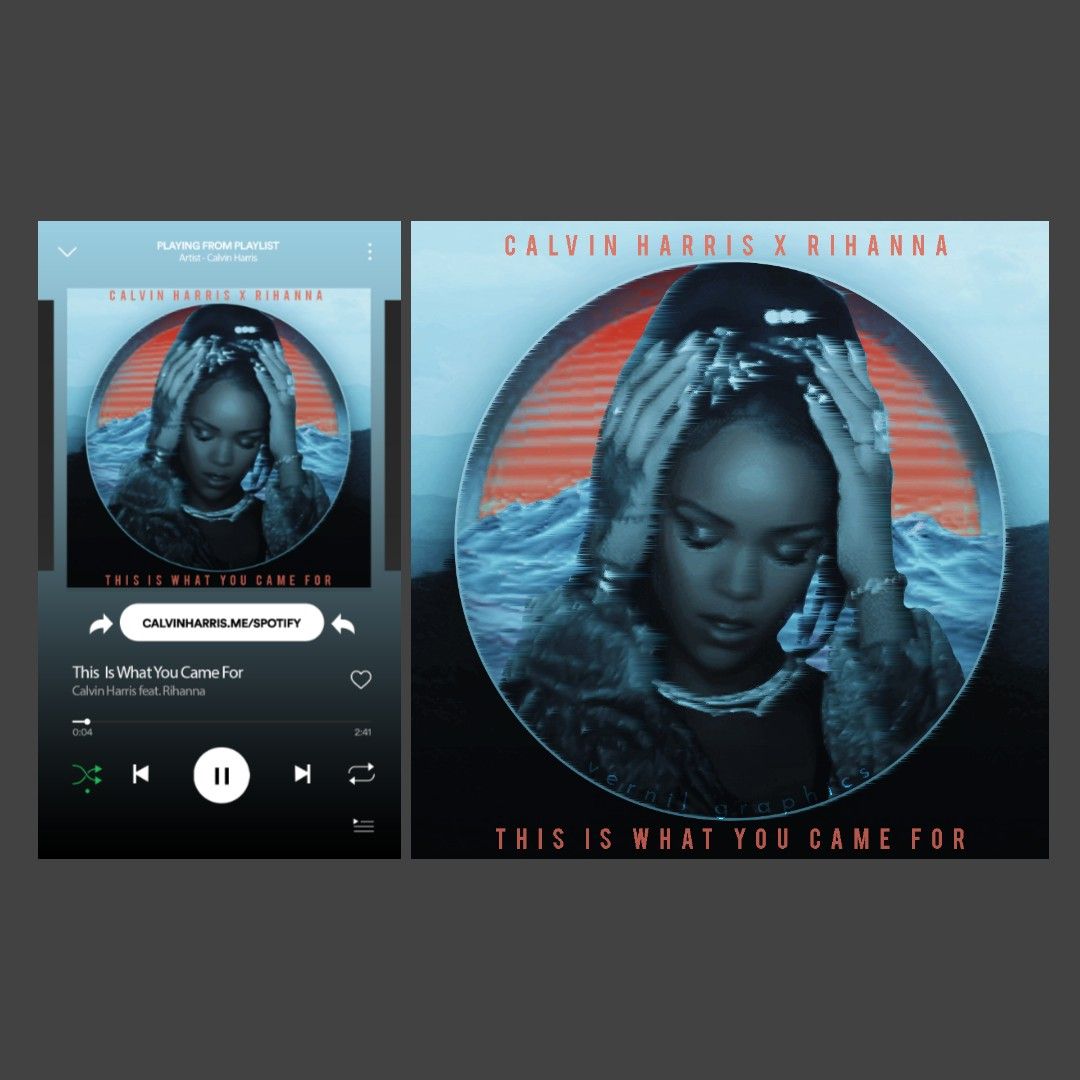
this is SO beautiful i cant even begin to explain. it captures the vibe of the mv and the song SO well. i love the title and the singer's name's placement. it looks like a literal cover and the little tv static filter looks super cool!
✧ ⋆ · * . · . · · .
. . . · + · * ✫ * ⊹ * ˚ ✧ ⋆ · * . · . · · .
. . . · + · * ✫ * ⊹ * ˚
if ur entry isn't here, let me know in pm
Bạn đang đọc truyện trên: AzTruyen.Top