⟿ composition

"T R A U M A"
..composition.

˓ ִֶָ𓄲 ☁️ BEFORE WE START 𖦹 ࣪˖ ˒
I honestly do not even know how to explain or where to start. I feel like this is such a complex topic but also something that you just... need to get a hang of?? Like, "learning by doing" kind of stuff.
But nonetheless I will try to somehow provide as much helpful information and advice as possible, all based off of personal experience. So, this is by no means the only way to get things right and I too still make mistakes. Learning by doing guys, learning by doing..
Just a little disclaimer beforehand, the examples down below are just a small excerpt from all the different things that "composition" is build off. There is a possibility I could have forgotten about something or added informations that someone else would have categorized differently.
Another disclaimer: all the following examples are model based concepts, because that is what I mostly (if not only) work with. Sooo, I can not guarantee that all the things mentioned work the exact same for text based or object based stuff, but it should be adaptable.
⛓
˓ ִֶָ𓄲 ☁️ COMPOSITION 𖦹 ࣪˖ ˒
As mentioned before, the overall composition of a creation consists of various different aspects. It is impossible to pin it down to just one or two things and not everyone may agree with what I decided to point out down below. But I tried my best to talk about what I consider the most important parts that make up the composition of a design.
₀₀₁ balance:
"Balance" is honestly such a broad and vague word, just like "composition". A lot of components can have an effect on your work's balance, such as text (placement, sizing, the amount of text etc...) or models and objects (again... placement, sizing, the amount of models/objects etc...) and even such things as lighting and colors. "Balance" is not something one could define or give a step by step tutorial for, it is rather something you need to get a gist of by continuously practicing. Nonetheless I tried to provide an example of what could be considered an "unbalanced design".
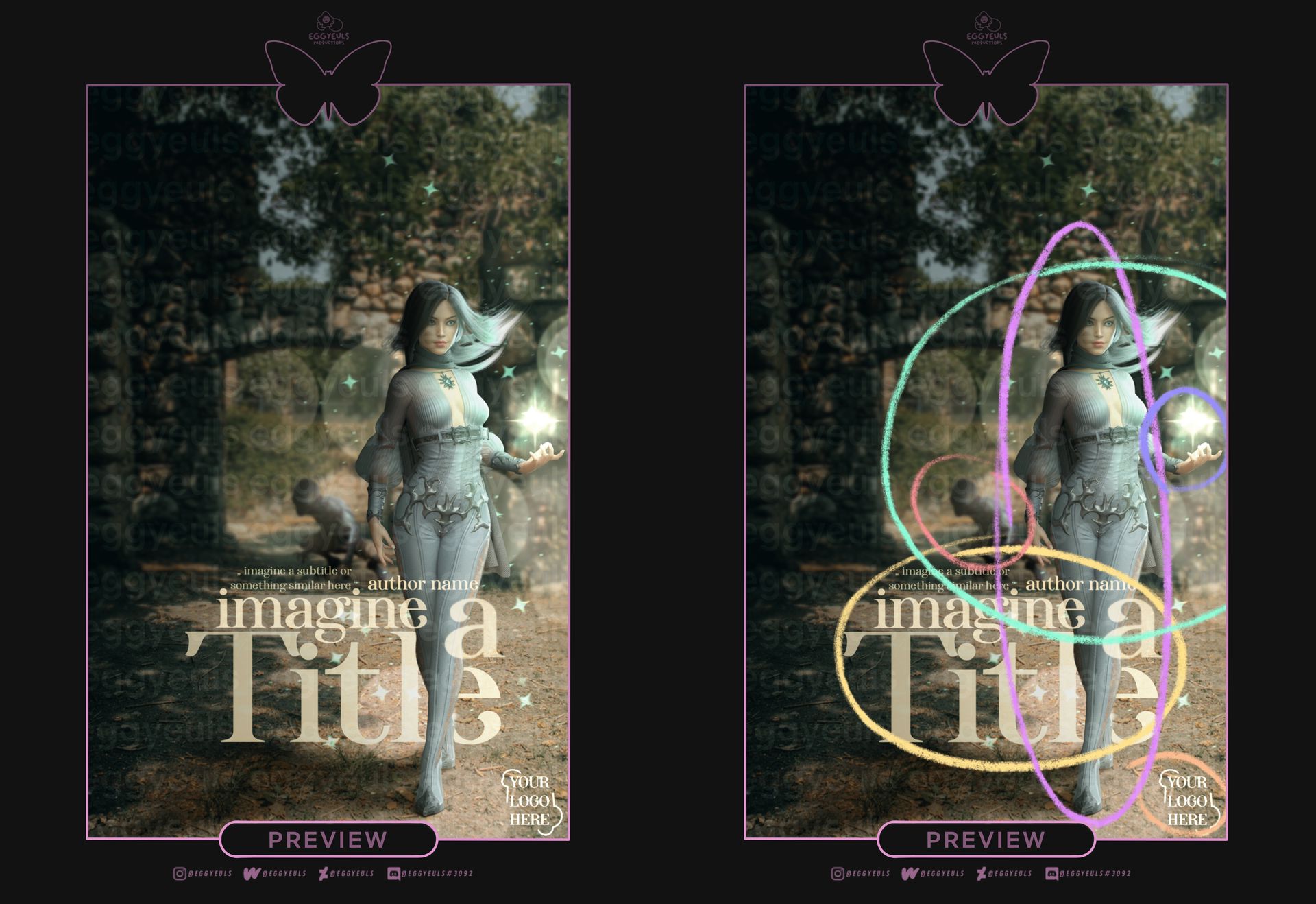
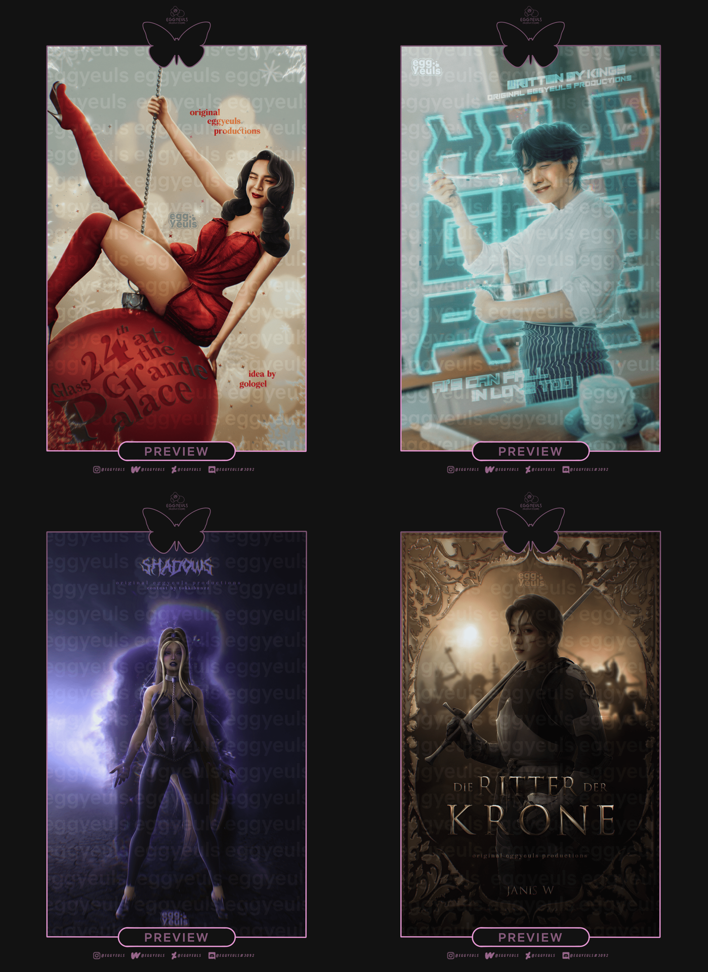
This example may not immediately seem to be "off (balance)" to untrained eyes. And untrained eyes does not mean i am only referring to less experienced designers, even advanced designers can make "mistakes" with balance and composition as it is shown in the example above. Now, i didn't even do much, other than adding a background, a two models with very subtle respective lighting adjustments, the magic stuff and bokeh/glitter effects. Some raw text and overall lighting adjustments. But as you can see on the image to the right, where I circled certain aspects, the overall design has still become rather clustered towards the bottom right corner. The two models are focused between the center and the right side, the light effects and magic stuff are almost only effecting the right side too, the text does move a bit more towards the center but is still very crowded and "squished" together overall. Then the watermark or logo is also being placed to the right bottom corner and looks misplaced in general. And even if the shadows on the left help balance the lighting situation a bit, the respective half up to the top left corner of the design is rather empty, compared to everything going on in the other half towards the bottom right corner. It is quite difficult to put it into proper words, so I hope the visualization with the circled elements helps to see the "imbalance" within this example design.
Do not get me wrong, sometimes it can help with guiding the viewer's focus when you saturate the design more at some parts and less at others, or use more intense lighting at some parts and less at others (for example). You can also focus text or models more towards a certain side of the canvas, but there always needs to be a counterpart of some sort, that helps to balance out the composition. It does not always need to be perfectly centered or in 50/50 balance or whatever, but overall you should just keep an eye on whether or not you may be overdoing it or forgot to pay attention to something.
₀₀₂ perspective & depth:
Now, it is not always necessary to use a lot of blur or try to imitate a "pro camera", by giving every component of your creation a different kind or amount of blur. But at times it can come in really handy to use a bit of motion blur or even just Gaussian blur. Paper notes falling down, all scattered around the room? Birds flying by the scenery or other people passing by your main character? A bit of motion blur could help with that "moving/falling" aspect. Your model standing in the middle of a crowded room or within a park full of different decorative constructions, trees and bushes? Some Gaussian blur, depending on how far away/close up those other elements are, could definitely help keep the focus on you character and create more depth. It is a bit difficult to explain, so just take a look at the example below.
This may not be the perfect example, as there is not much blurred out (basically only the trees in the front, the scenery in the far back, as well as the camp fire) and some of the raw resources had a horrible quality to begin with. So it is not easy to notice right away, but it still does make a difference.
It actually may be a perf er example for "sometimes less is more" and you do not always need many blurred elements.
Again, blurring out stuff is not always necessary, but if used the right way it can help a lot. Just do not play around with it all randomly and try to make it make sense.
Same goes for the overall perspective. A background scenery where it looks like the viewer sits on the ground and is looking upwards, combined with other objects/models that seem to be looked at directly or from above (as roughly demonstrated in the example below) do not work well together. Long story short: do not mix the "bird's eye view" with the "ant's eye view" for example. It will just add a very unrealistic and weird feeling/vibe to your work. You can play around with perspective and all, but do not forget to adjust the individual components of your design accordingly or try to collect resources that would fit what you have in mind right from the beginning.
₀₀₃ proportions:
Well, there is this thing called "creative freedom" and especially with the fantasy genre you can pretty much go wild, even come up with your own creatures, planets, habitats and such stuff. Feel free to adjust and manipulate certain components the way you need to, but try to make everything make sense in some way at least. Keep any adjustments according to whatever (un)written rules your respective scenery/setting requires. Do not try to excuse everything with "creative freedom" or "limited skills". Do not start to make your characters limbs unnaturally long, weirdly angled (especially for necks and heads) or twist them in unhealthy looking ways in general. Do not make trees (or other stuff) that are 100 feet away from your character/object/main focus the same size/width as trees that are 10 feet away from it.
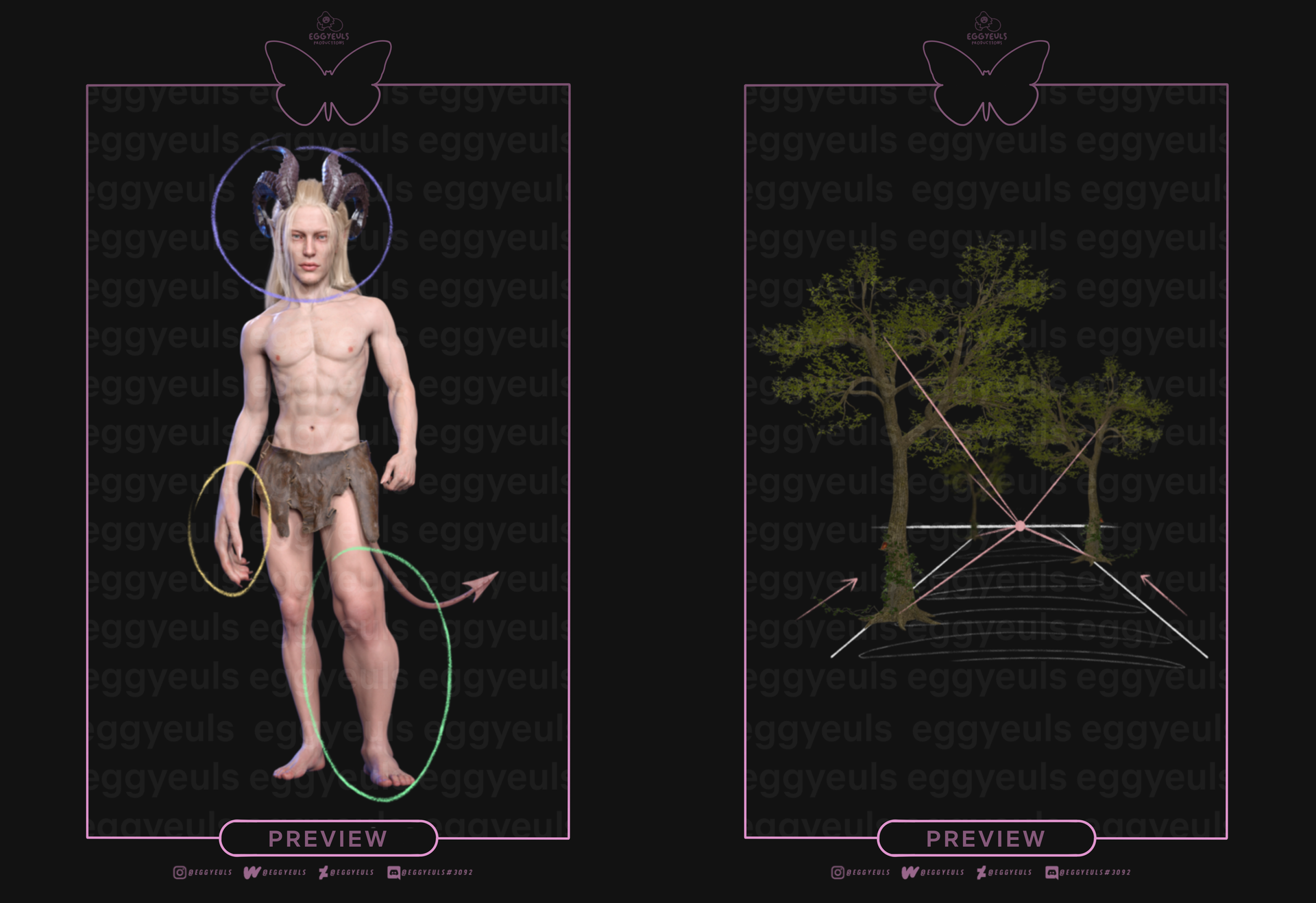
These may be the most hilarious and laziest examples ever, especially the character/model based one, totally over exaggerated there. But I hope it gets the message across. I have seen a lot on head swaps, character manipulations and scenery manipulations that unfortunately turned out to be a total mess. Everyone can make mistakes and sometimes not everything works out super perfectly smooth, I also still struggle with some things. So if you are unsure, whether or not what you are doing works out, just look at references (for proportions, body movements/positions or whatever else) or ask others for their opinions/advice.
₀₀₄ movement:
Adding some movement to the overall "flow" of your creation can avoid or balance out the stiffness, well, obviously. See it as "adding some spice" to a dish that technically is doing okay on its own but could do much better with even just a grain of extra salt. Now, it is far easier to end up with "stiff" or "flat" look to your design, due to how the model is being displayed/exposed to the viewer, thank you may expect. Which is something I struggle with a lot myself, the majority of my creations unfortunately has this sort of "set up". But just like that it is also rather easy to try and avoid that stiffness with some tricks. You could try to work with models that already have some sort of movement in their body (sitting or posing in a certain way, flowing hair or clothing, running position etc). Instead of always portraying a character from the front view, try other perspectives (make them have their back to the viewer and the head turned, as if they were about to turn around to us, maybe even tilt the whole scenery a bit). Same goes for working with other "objects" or even text.
As you can see, I tried to portray four different ways to add a bit (or a lot) of dynamic to your creation. In the upper left example, the model is not only posing in a pretty dynamic way, but also tilted a bit, to make it look like they are swinging from one side to the other. As for the example on the upper right, the overall design has been angled, as if the viewer is tilting their head, I guess (difficult to put into words, but I hope you get what I mean). In addition to that, the text behind the character has been warped a bit and the switch between text in front and behind the character also helps supporting a more dynamic look to everything. Moving on to the bottom left example, the character itself has a rather powerful yet still pose, supported by the cloud of smoke that is rising straight upwards. In order to still achieve some subtle dynamic I drew her ponytail in a very "flowy" way, we well as multiple loose strands following the movement roughly. Even small things like that can make a difference, as proven by the last example on the bottom right. The frame and quite stiff positioning of the model are being slightly loosened up by a rather busy background with (in comparison) more movement included. As you can see, you do not always have to go all out, small tricks can go a long way too.
₀₀₅ organized chaos:
Sometimes it is quite fun to play around with lots of stuff, tho I am sure the saying "sometimes less is more" has not become so popular for nothing. So, as much fun as it may be to experiment, we should try to keep the chaos somewhat organized. Tho it for sure also depends on your editing style/technique, especially when it comes to "blends" or "aesthetics" (or whatever is the right term for it). Just for the funsies I would like to add some examples down below, where I feel like it is borderline messy but still somewhat "organized chaos".

Okay, I have to admit, the example on the left is very much on the "borderline messy" side. The text on the left ("a good girls guide") was placed with more focus on the aesthetic rather than on functionality and the model's center is also more based on the left I suppose. But overall, despite the composition not being perfect, it still works. As for the one in the middle, it is much calmer. We do have paper notes floating around but they help guiding the focus and therefore could be considered "organized chaos". And last but not least, the example on the left speaks for itself I guess. There is a lot going on, a broad variety of different elements fonts and colors, but they all work pretty well together. I guess it just really depends on your editing style, the idea you have in mind and the execution of course. So, another "learning by doing".
⛓
˓ ִֶָ𓄲 ☁️ SOURCES 𖦹 ࣪˖ ˒
SOURCES 𖦹 ࣪˖ ˒
Down below is a summary of all sources used for this chapter.
₀₀₁ Text(s):
No external ones actually, everything said are my personal opinions/experiences
₀₀₂ Image(s):
Examples are my very own (intellectual) property
⛓
© eggyeuls, 2023
Bạn đang đọc truyện trên: AzTruyen.Top