⠀⠀𝑡𝑢𝑡𝑜𝑟𝑖𝑎𝑙 │𝑐𝑜𝑙𝑜𝑢𝑟𝑖𝑛𝑔.
This tutorial was requested by saudade750.
This tutorial can be applied to any graphic, whatever the format. Colouring is usually the last step of my designs. As most of my graphics attempt to blend images together, I use colouring to create a more cohesive piece. I'm going to be honest; my method when it comes to colouring is mostly guesswork.
Do not be like me. Research colour theory. Look up colour schemes. Find something that is cohesive, pretty, and works well to express the mood you are aiming for.
Then, and only then, get out your graphic. Today, I will be using an image of Chandler that Pinterest thankfully recommended me;
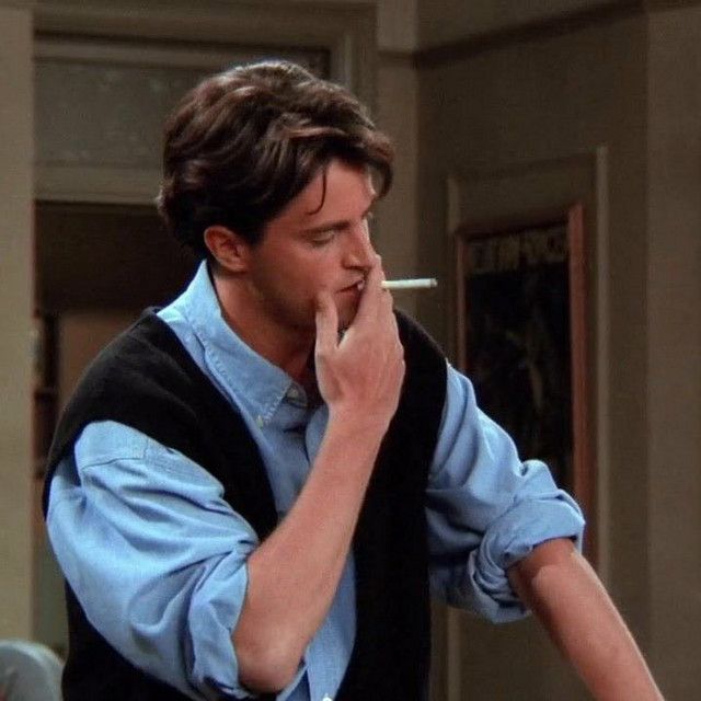
(Chandler fic coming soon)
My weapon of choice is Photopea, so load that onto your browser, and load your file like so;
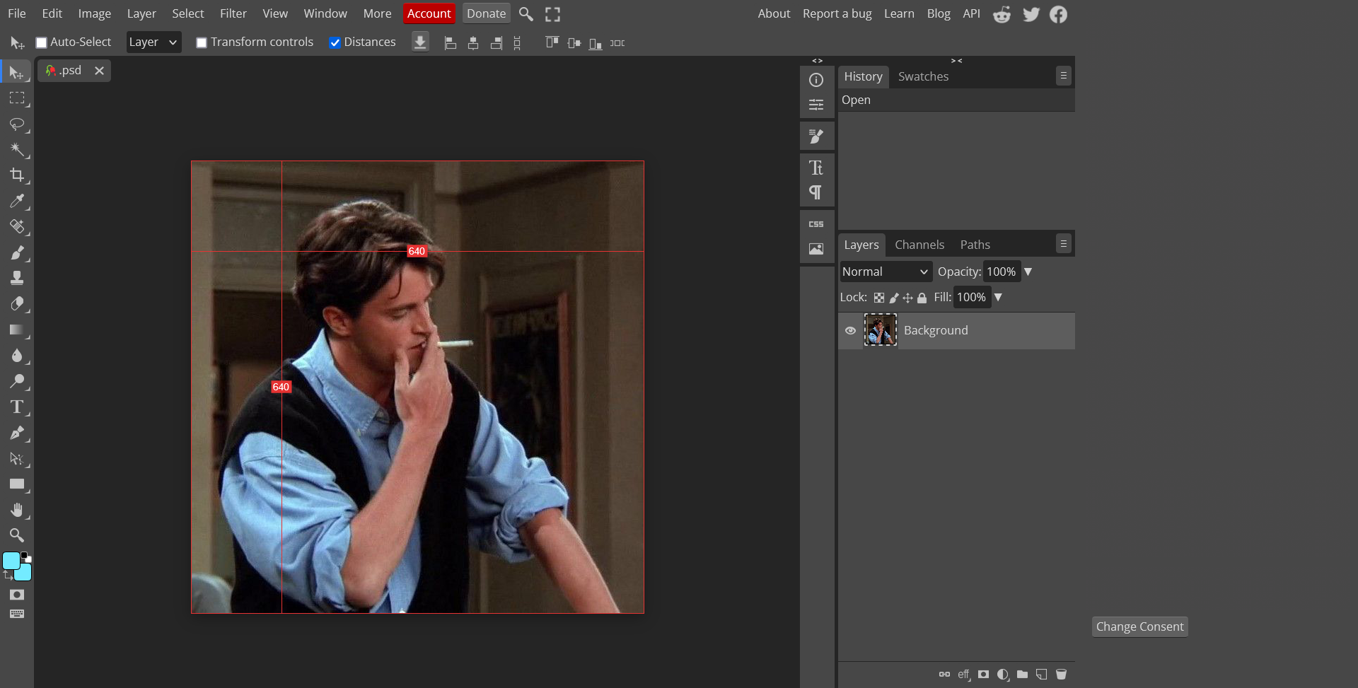
Now, "Layer" < "Adjustment Layer". From there, you can pick any colouring layer of your choice. These are the six that I will be going through today;
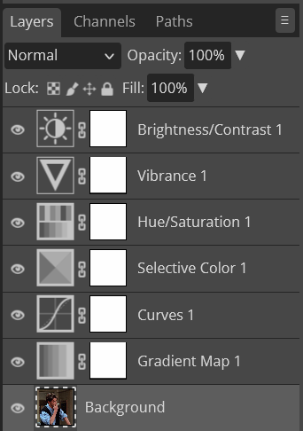
These are all the adjustment layers that I usually use, and the ones I will be going through today.
Firstly, Brightness/Contrast.
Very straightforward. Adjust Brightness and Contrast. Lowering brightness and increasing contrast can slightly deepen the colours as well as redefining the lines of the image. On the other hand, increasing the brightness and decreasing the contrast can mute the colours and grey areas of the image. This is what I ended up doing on my image;
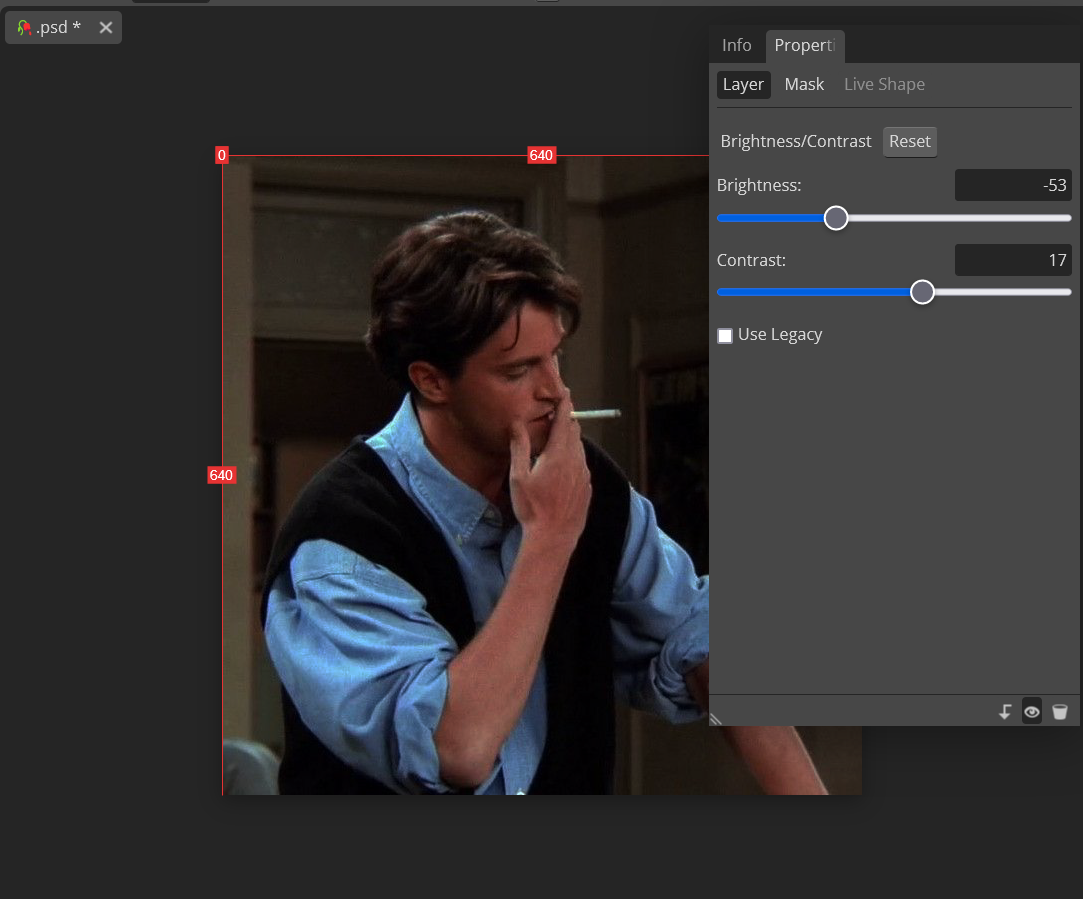
Honestly this just depends on your taste. I prefer contrasted and darker images, as they work better with the sort of mood my books lean into. Then again, I used to love lowering the contrast. In my last graphics book, the majority of my graphics had low contrast to create a greyish-metallic look. Experiment and see what works for you!
Next, Vibrance. Now, Vibrance and Saturation are quite similar. Both deepen the colours of your graphic. However, Vibrance does it far more subtly, whereas Saturation is a lot more...potent. I used to over-saturate my graphics (I probably still do), but I guess it depends on what feeling you are going for. Here is what I ended up with;
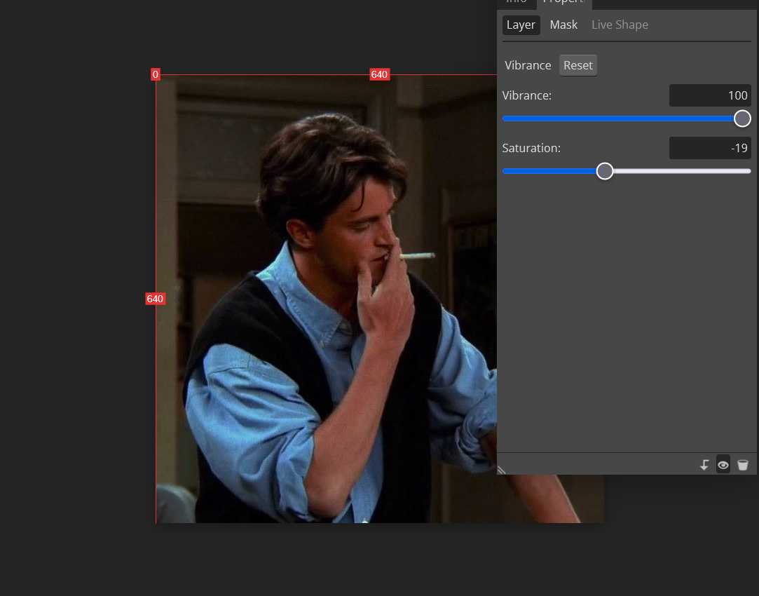
I also would like to apologise, as I did a lil oopsie when I was editing and forgot to take a screenshot of the whole screen, and instead just took a screenshot of the adjustment dials. Again, so sorry lovelies.
Ok, now we have Hue/Saturation. This is by far the most helpful colouring layer, and the one that makes most of an impact. You can adjust each colour in the image by hue, brightness, and saturation; it is so damn cool. I wanted to change the colour of Chandler's shirt in this image, so I adjusted the hue in cyan and blue. I also tweaked the redness of his skin, as yet again I oversaturated. I usually like to darken the red, but again, it is completely up to you and your preference.
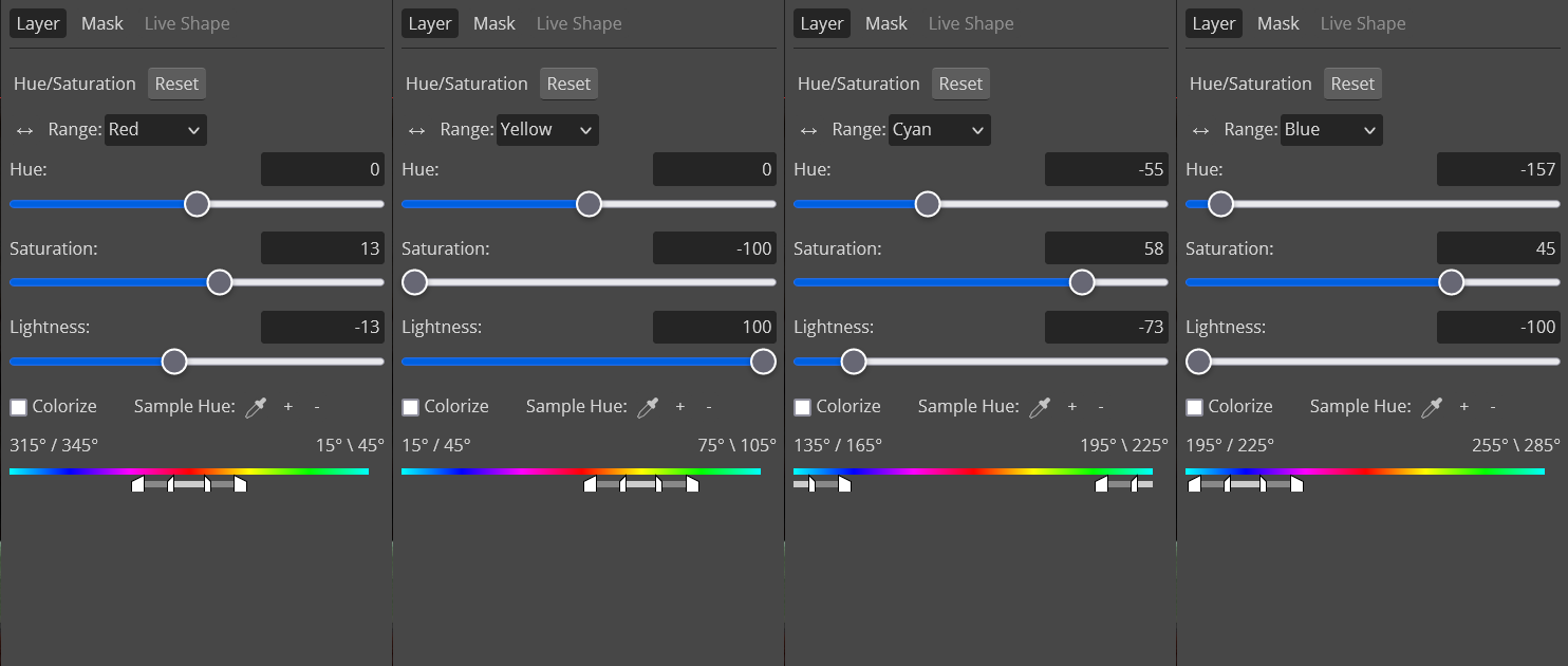
Then I moved onto the Selective Colour layer. Now this is a little similar to the previous layer, except you have a lot more range. You can not only adjust colours, but you can adjust the white and black of the image, as well as the neutral, or the "temperature" of the image. I suppose these layers could be used interchangeably, but I think Hue/Saturation is a much easier colouring layer to use. Selective Colour can be a bit trickier to get the hang of because it relies a lot more on colour theory. However, it does allow you a lot more range in editing colours and how they appear in the image. I did the following;
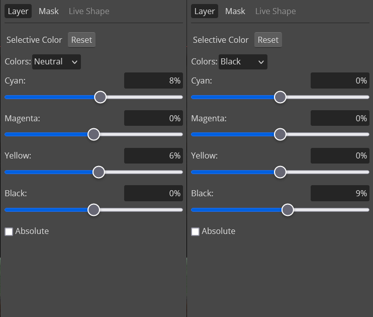
The adjustment is slight, but potent.
Next, we have curves! Curves essentially give you more power to control shadows, highlights, and midtones separately. If you drag the anchor points down, it will darken the image. If you drag them up, it lightens them. I will be honest, I'm not totally sure how they work and if I've entirely mastered them. I just move it around, make a nice graph, and pray the image looks okay. You don't always need a curve, and I very rarely use them in GIFs. I would recommend, if you do use it, to experiment a few times. Don't worry if you don't get it right the first time. This is what I did for this image;
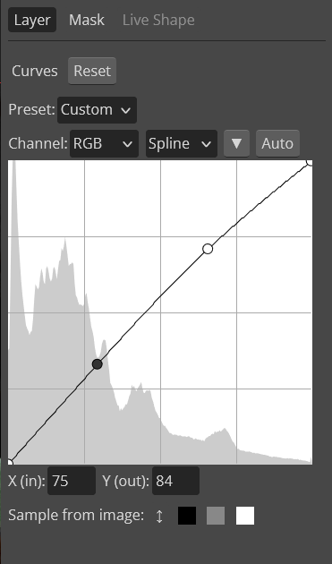
I finally remembered to save the image, and this is what we have;

As you can see, Chandler has had a wardrobe change, thanks to the adjustments of Blue and Cyan on Hue/Saturation. The background temperature has become colder as a result of the adjustment made to Black on Selective Colour. This has also made his hair a touch darker. His skin looks a little less Magenta, which mellows the oversaturation.
Honestly I would have left the image like this, but there is one more layer I must go through that I discovered recently; Gradient Map.
It is really cool. Essentially, you create a gradient in this function, and it alters the shadows, midtones and highlights to create this awesome gradient. This is what I did;
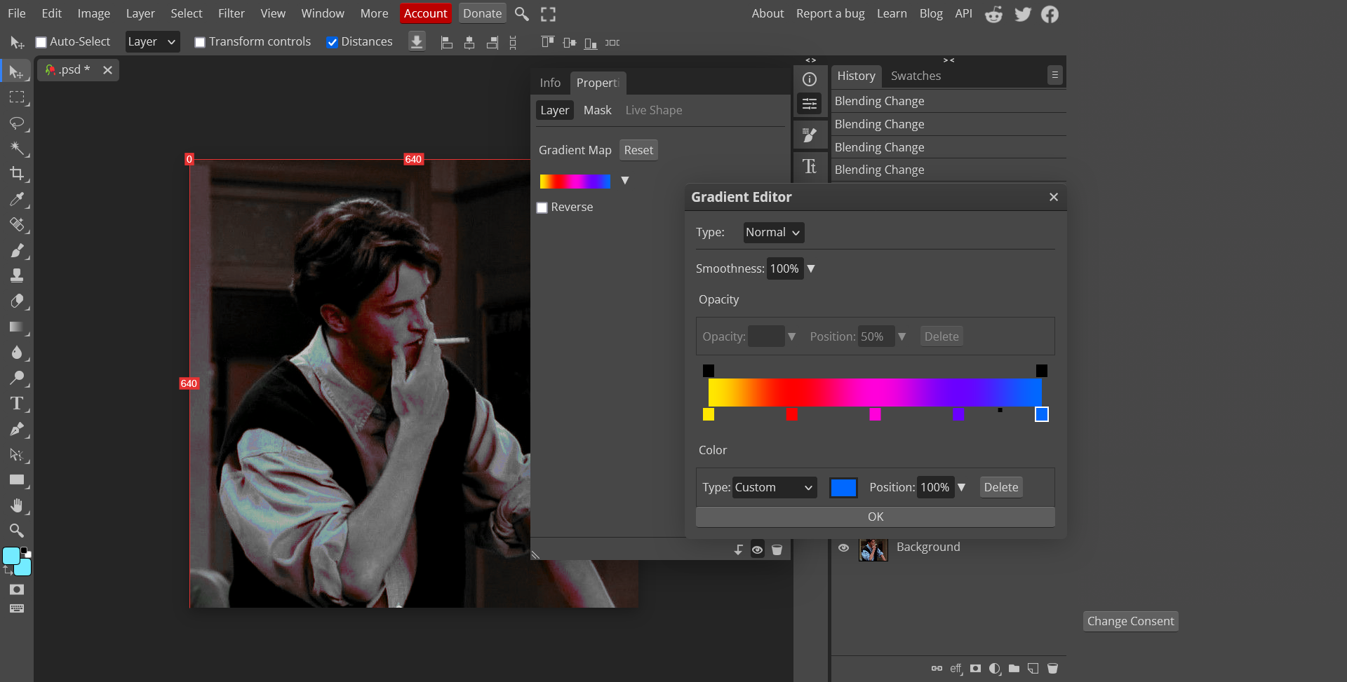
I will be honest, I probably wouldn't do it like this again. Again, it is another function I haven't quite mastered, but it is there if you want to try it out! If you are to try it out though, I would recommend you to use it as the first layer you use.
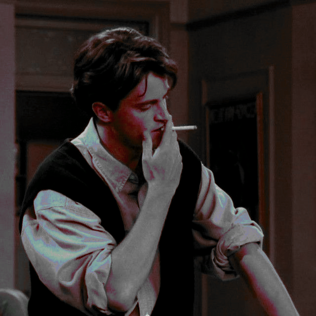
Yeah I kind of hate this. I prefer the other one.
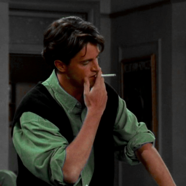
Better. Profile picture worthy. I added the blur filter over this to make it look a little softer.
Um so this was a bad tutorial, but hoped it helped a little? If you would like any more help (because this was definitely not educational), check out the YouTubers "How To Digital", "Mufasa CAD" and "Simply How To". Honestly, even Photoshop tutorials, since Photopea is functional almost identical to Photoshop. I hope I've helped at least one person. If you would like any other tutorials, please request!
Bạn đang đọc truyện trên: AzTruyen.Top